3 Data Analysis and Visualization
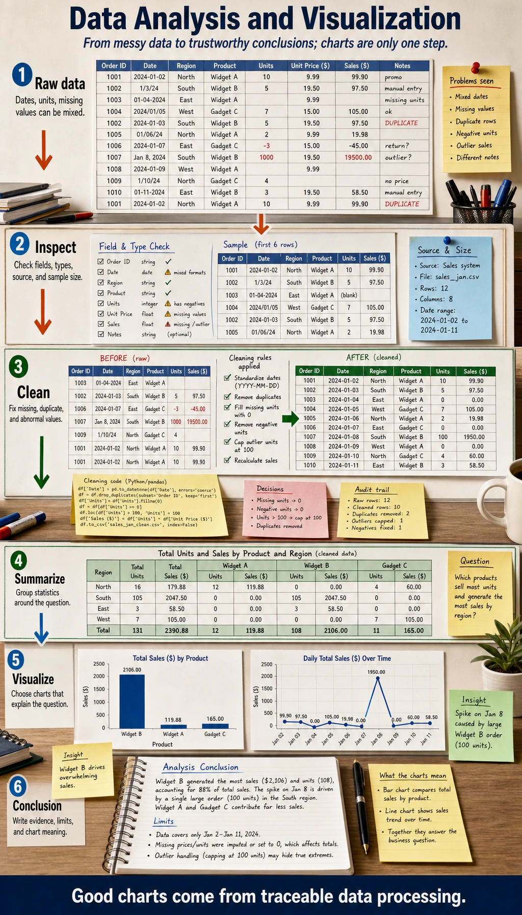
Chapter 3 has one job: help you turn messy data into a trustworthy conclusion with reproducible code and charts.
See The Data Analysis Loop
Section titled “See The Data Analysis Loop”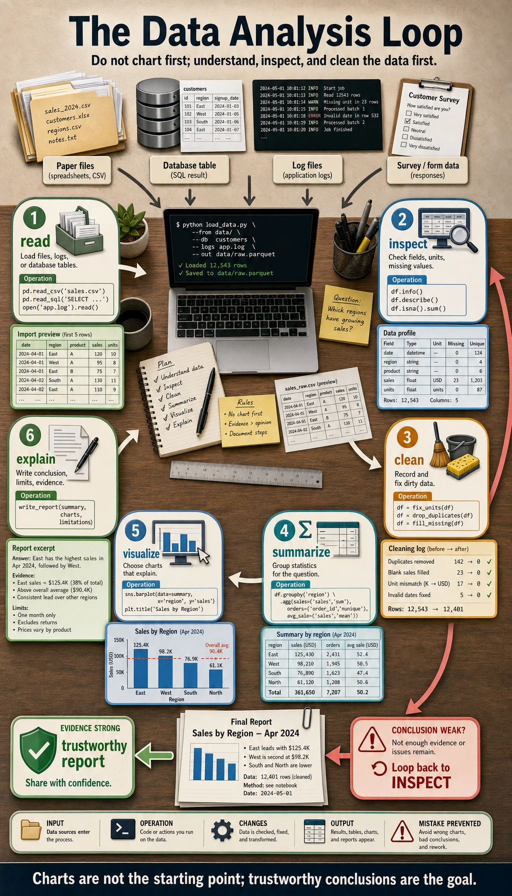
Read the picture first. Most useful analysis follows this loop:
Do not draw charts first. First understand fields, units, missing values, duplicates, and sample sources.
Learning Order And Task List
Section titled “Learning Order And Task List”Use this checklist as both the chapter guide and the task sheet. Each step should make clear where the data came from, how it changed, and what supports the conclusion.
-
3.1.1 Pure Python Data Processing Follow along: process a small table with lists and dictionaries. Evidence to keep: a note explaining why tables become awkward in pure Python.
-
3.2.1 NumPy Overview to 3.2.7 Random and Statistics Follow along: practice arrays, shapes, slicing, broadcasting, and vectorized math. Evidence to keep: one NumPy practice file.
-
3.3.1 Pandas Core Structures to 3.3.8 Time Series Follow along: read a table, clean missing values, group rows, merge tables, and export results. Evidence to keep: cleaned data plus a cleaning log.
-
3.4.1 Matplotlib to 3.4.4 Visualization Best Practices Follow along: draw charts that answer named questions. Evidence to keep: 3 charts, each with one conclusion.
-
3.5.1 Relational Databases to 3.5.4 Database Design Follow along: learn enough SQL to filter, group, and join real application data. Evidence to keep: one query or join example.
-
3.6.1 EDA Project and 3.6.3 Follow-Along Workshop Follow along: build a reproducible data pipeline and report. Evidence to keep: raw data, clean data, chart, report, and README.
Key terms for this chapter:
| Term | Meaning |
|---|---|
CSV | A plain-text table where each row is a record |
DataFrame | A Pandas table with rows, columns, names, and indexes |
Series | One column from a DataFrame |
dtype | The data type of a column or array |
EDA | Exploratory Data Analysis: first-pass exploration before modeling |
groupby | Split by category, calculate statistics, then combine |
merge / join | Combine tables by shared keys |
First Runnable Loop
Section titled “First Runnable Loop”Install the two packages once:
python -m pip install pandas matplotlibThen run this script in an empty practice folder. It creates dirty data, cleans it, summarizes it, and saves one chart.
from io import StringIOimport pandas as pdimport matplotlib.pyplot as plt
raw = StringIO("""topic,minutesPython,45Pandas,30Python,45Visualization,Pandas,300""")
df = pd.read_csv(raw)print("Before cleaning")print(df)
clean_df = df.drop_duplicates()clean_df["minutes"] = clean_df["minutes"].fillna(clean_df["minutes"].median())clean_df = clean_df[clean_df["minutes"] <= 180]
summary = clean_df.groupby("topic")["minutes"].sum().sort_values(ascending=False)print("\nAfter cleaning")print(summary)
summary.plot(kind="bar", title="Study minutes by topic")plt.ylabel("minutes")plt.tight_layout()plt.savefig("topic_minutes.png")print("\nSaved chart: topic_minutes.png")
Expected shape:
Before cleaning...After cleaningtopicPython 45.0Visualization ...Saved chart: topic_minutes.pngThe pass line is not “the chart looks nice.” The pass line is: you can explain which rows changed, why they changed, and how that affects the conclusion.
How to read this output
Section titled “How to read this output”Before cleaningshows the raw evidence, including duplicates, missing values, and outliers.After cleaningshows the transformed table you are actually using for analysis.topic_minutes.pngis the report artifact; keep it with the script that generated it.- If the conclusion changes after another cleaning rule, write that down instead of hiding it.
Depth Ladder
Section titled “Depth Ladder”| Level | What you can prove |
|---|---|
| Minimum pass | You can read a table, inspect shape/types/missing values, clean obvious problems, and save one chart. |
| Project-ready | Your report names the question, cleaning rules, summary table, chart, conclusion, limitation, and rerun command. |
| Deeper check | You can test whether the conclusion changes under another cleaning rule, spot leakage or sampling bias, and explain why a chart type fits the question. |
Evidence to Keep
Section titled “Evidence to Keep”Keep this page’s proof of learning as a small evidence card:
- Data Source
- raw records or small dataset used
- Processing Step
- pure Python, NumPy, Pandas, charting, or SQL operation
- Output
- cleaned data, statistic, chart, query result, or report note
- Failure Check
- missing data, shape mismatch, wrong aggregation, or unclear question
- Expected Output
- data artifact plus the evidence needed to trust it
Common Failures
Section titled “Common Failures”| Symptom | First thing to check | Usual fix |
|---|---|---|
| Chart is pretty but conclusion is weak | Did you name the question first? | Write the question above the chart |
| Grouped result looks wrong | Category spaces, aliases, or inconsistent case | Print unique() and normalize categories |
| Missing values change the conclusion | Which rows and columns are missing? | Record the rule: drop, fill, or keep |
| Correlation looks too perfect | Time, scale, leakage, or sampling bias | Compare groups and add limitation notes |
| Notebook cannot rerun | Data path, dependency, or execution order | Restart and run from top to bottom |
Pass Check
Section titled “Pass Check”Move to Chapter 4 when you can answer these five questions:
- What does each column mean, and what unit does it use?
- Which cleaning rules changed the data?
- What question does each chart answer?
- What conclusion is supported, and what is still uncertain?
- Can another person rerun the analysis from the README?
For a printable checklist, use 3.0 Study Guide and Task Sheet. The next chapter uses this data intuition to understand probability, vectors, gradients, and model evaluation.
Check reasoning and explanation
- Use the five pass-check questions as a small data story, not as five separate slogans.
- A complete answer names the columns and units, lists every cleaning rule that changed rows or values, ties each chart to one explicit question, separates supported conclusions from uncertainty, and includes a README that lets another person rerun the notebook or script.
- If any answer depends on memory instead of a saved table, chart, or command output, the evidence pack is not ready yet.