
5.1.6 Scikit-learn と Matplotlib 実践ワークショップ
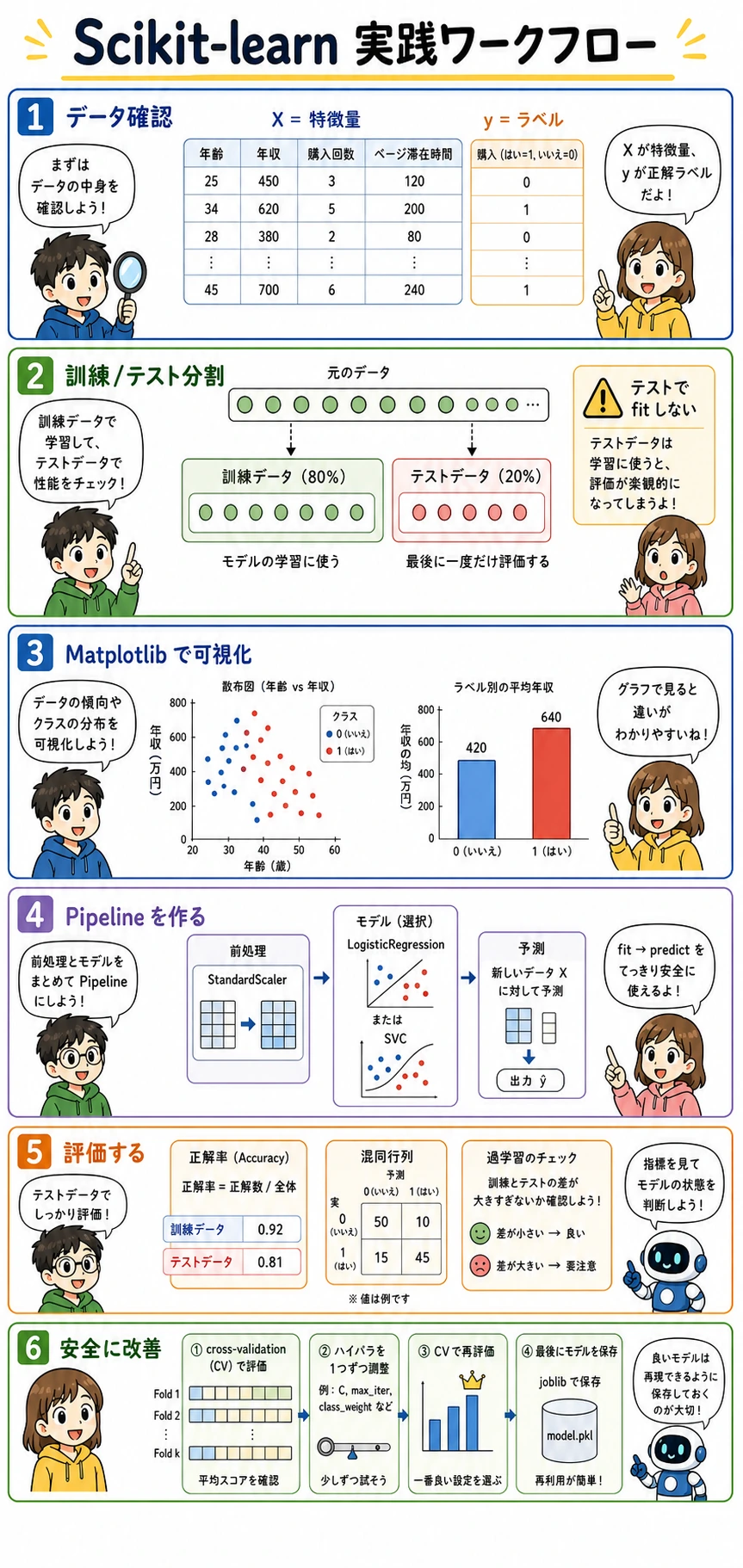
X、y、X_train、X_test、y_train、y_testが実コードで何を意味するか理解する- Matplotlib でデータと結果を見てからスコアを信じる習慣を作る
- 前処理とモデルをまとめた sklearn
Pipelineを作る - 訓練スコアとテストスコアを比べ、過学習に気づけるようになる
- 交差検証を使い、1つずつ安全に調整する
joblibで学習済み Pipeline を保存・再読み込みする
まず実行用セルを準備する
Section titled “まず実行用セルを準備する”新しい Notebook または Python ファイルを作り、最初に次を実行します。
import numpy as npimport matplotlib.pyplot as plt
from sklearn.datasets import load_winefrom sklearn.model_selection import train_test_split, cross_val_scorefrom sklearn.pipeline import make_pipelinefrom sklearn.preprocessing import StandardScalerfrom sklearn.linear_model import LogisticRegressionfrom sklearn.metrics import ConfusionMatrixDisplay, classification_report
np.set_printoptions(precision=3, suppress=True)
import sklearn が失敗する場合は、同じ Python 環境でインストールします。
python -m pip install --upgrade scikit-learn matplotlib joblibpip はパッケージをインストールする道具です。python -m pip は「今使っている Python に対応する pip を使う」という意味で、別の環境に入れてしまうミスを減らせます。
データを読む:特徴量とラベルを分ける
Section titled “データを読む:特徴量とラベルを分ける”sklearn の例では、X と y が何度も出てきます。
Xは特徴量行列です。1行が1サンプル、1列が1つの入力特徴量です。yはラベルベクトルです。モデルに学習してほしい答えです。X.shapeは(サンプル数, 特徴量数)を表します。y.shapeはラベル数を表します。
wine = load_wine()X = wine.datay = wine.target
print("X shape:", X.shape)print("y shape:", y.shape)print("Feature names:", wine.feature_names[:5], "...")print("Class names:", wine.target_names.tolist())print("First sample features:", np.round(X[0], 2))print("First sample label:", y[0], "=>", wine.target_names[y[0]])
期待される出力:
X shape: (178, 13)y shape: (178,)Feature names: ['alcohol', 'malic_acid', 'ash', 'alcalinity_of_ash', 'magnesium'] ...Class names: ['class_0', 'class_1', 'class_2']First sample features: [ 14.23 1.71 2.43 15.6 127. 2.8 3.06 0.28 2.29 5.64 1.04 3.92 1065. ]First sample label: 0 => class_0Matplotlib 基礎:図を読んでからモデルを見る
Section titled “Matplotlib 基礎:図を読んでからモデルを見る”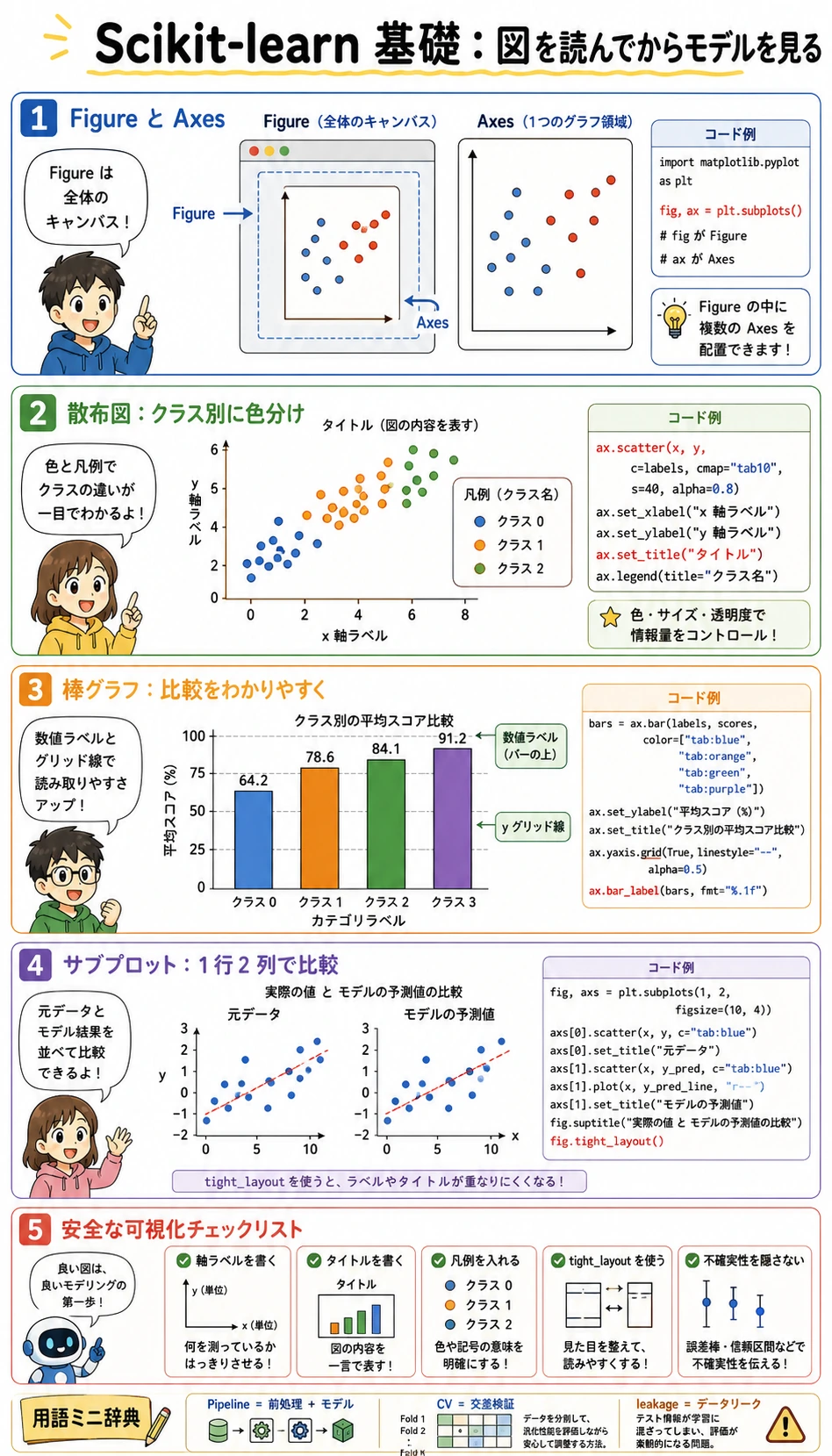
Matplotlib では、初心者が混乱しやすい言葉が2つあります。
Figure:全体のキャンバスです。Axes:キャンバス内の1つのグラフ領域です。
入門段階では、次の形をよく使います。
fig, ax = plt.subplots(figsize=(6, 4))ax.scatter(x_values, y_values)ax.set_xlabel("x-axis label")ax.set_ylabel("y-axis label")ax.set_title("Chart title")ax.grid(True, alpha=0.3)plt.tight_layout()plt.show()Wine データセットから2つの特徴量を描いてみます。
feature_x = 0  # alcoholfeature_y = 6  # flavanoids
fig, ax = plt.subplots(figsize=(7, 5))scatter = ax.scatter(    X[:, feature_x],    X[:, feature_y],    c=y,    cmap="viridis",    s=45,    alpha=0.85,)
ax.set_xlabel(wine.feature_names[feature_x])ax.set_ylabel(wine.feature_names[feature_y])ax.set_title("Wine data: two-feature view")ax.grid(True, alpha=0.3)ax.legend(    handles=scatter.legend_elements()[0],    labels=wine.target_names.tolist(),    title="Class",)
plt.tight_layout()plt.show()
見るポイントは次の通りです。
- クラスは少し分かれて見えるか?
- 重なっている領域はあるか?
- 数値範囲が極端に大きい特徴量はあるか?
可視化の価値は、モデルスコアを見る前に、問題の難しさを肌感覚でつかめることです。
データ分割:テストセットを隠しておく
Section titled “データ分割:テストセットを隠しておく”train_test_split は訓練セットとテストセットを作ります。
- 訓練セット:モデルが学習してよいデータです。
- テストセット:最後の評価にだけ使うデータです。
stratify=y:訓練とテストでクラス比率を近く保ちます。random_state:同じ分割を再現できるようにします。
X_train, X_test, y_train, y_test = train_test_split(    X,    y,    test_size=0.2,    random_state=42,    stratify=y,)
print("X_train:", X_train.shape, "y_train:", y_train.shape)print("X_test: ", X_test.shape, "y_test: ", y_test.shape)
期待される出力:
X_train: (142, 13) y_train: (142,)X_test: (36, 13) y_test: (36,)Pipeline を作る:前処理とモデルをまとめる
Section titled “Pipeline を作る:前処理とモデルをまとめる”ロジスティック回帰、SVM、KNN などは特徴量のスケールに敏感です。Wine データセットは列ごとの単位がかなり違うため、モデルの前に StandardScaler を置きます。
model = make_pipeline(    StandardScaler(),    LogisticRegression(max_iter=1000, random_state=42),)
model.fit(X_train, y_train)
train_score = model.score(X_train, y_train)test_score = model.score(X_test, y_test)
print(f"学習精度:{train_score:.1%}")print(f"テスト精度:{test_score:.1%}")
期待される出力:
学習精度:100.0%テスト精度:100.0%Pipeline が大事なのは、正しい順番を保てるからです。
- 訓練データでは、
StandardScaler.fit_transformのあとにモデルのfit - テストデータでは、
StandardScaler.transformのあとにモデルのpredict
この違いがデータリークを防ぎます。
予測し、具体例を見る
Section titled “予測し、具体例を見る”スコアだけでなく、実際の予測例も少し確認しましょう。
y_pred = model.predict(X_test)proba = model.predict_proba(X_test[:5])
for i in range(5):    predicted_name = wine.target_names[y_pred[i]]    true_name = wine.target_names[y_test[i]]    confidence = proba[i].max()    print(f"Sample {i}: predicted={predicted_name}, true={true_name}, confidence={confidence:.1%}")
出力例:
Sample 0: predicted=class_0, true=class_0, confidence=99.9%Sample 1: predicted=class_1, true=class_1, confidence=99.9%Sample 2: predicted=class_0, true=class_0, confidence=99.5%Sample 3: predicted=class_1, true=class_1, confidence=99.7%Sample 4: predicted=class_2, true=class_2, confidence=99.9%predict は最終クラスを返します。predict_proba は各クラスの確率分布を返します。確率は、しきい値、手動確認、リスク順位付けなどで役立ちます。
混同行列とレポートで評価する
Section titled “混同行列とレポートで評価する”Accuracy だけでは、どのクラスを間違えたのかが見えません。混同行列は、実ラベルと予測ラベルを表にして見せます。
fig, ax = plt.subplots(figsize=(5, 5))ConfusionMatrixDisplay.from_estimator(    model,    X_test,    y_test,    display_labels=wine.target_names,    cmap="Blues",    ax=ax,    colorbar=False,)ax.set_title("Confusion matrix on test set")plt.tight_layout()plt.show()
print(classification_report(y_test, y_pred, target_names=wine.target_names))
読み方:
- 対角線は正しく予測できた数です。
- 対角線以外は間違いです。
- Precision は「A と予測したもののうち、本当に A だった割合」です。
- Recall は「本当に A だったもののうち、どれだけ見つけたか」です。
- F1 は precision と recall をまとめた指標です。
同じ流れで複数モデルを比べる
Section titled “同じ流れで複数モデルを比べる”sklearn は API が統一されているため、モデル比較がしやすいです。
from sklearn.tree import DecisionTreeClassifierfrom sklearn.neighbors import KNeighborsClassifierfrom sklearn.svm import SVC
models = {    "Logistic Regression": make_pipeline(        StandardScaler(),        LogisticRegression(max_iter=1000, random_state=42),    ),    "Decision Tree": DecisionTreeClassifier(max_depth=4, random_state=42),    "KNN": make_pipeline(StandardScaler(), KNeighborsClassifier(n_neighbors=5)),    "SVM": make_pipeline(StandardScaler(), SVC(kernel="rbf", C=1.0, gamma="scale")),}
results = {}for name, clf in models.items():    clf.fit(X_train, y_train)    results[name] = {        "train": clf.score(X_train, y_train),        "test": clf.score(X_test, y_test),    }    print(f"{name:20s} train={results[name]['train']:.1%} test={results[name]['test']:.1%}")
出力例:
Logistic Regression train=100.0% test=100.0%Decision Tree train=99.3% test=94.4%KNN train=97.9% test=97.2%SVM train=100.0% test=100.0%比較を棒グラフで描きます。
fig, ax = plt.subplots(figsize=(9, 5))names = list(results.keys())x = np.arange(len(names))width = 0.35
train_scores = [results[name]["train"] for name in names]test_scores = [results[name]["test"] for name in names]
bars_train = ax.bar(x - width / 2, train_scores, width, label="Train", color="steelblue")bars_test = ax.bar(x + width / 2, test_scores, width, label="Test", color="coral")
ax.set_xticks(x)ax.set_xticklabels(names, rotation=15, ha="right")ax.set_ylabel("Accuracy")ax.set_title("Model comparison on Wine dataset")ax.set_ylim(0.8, 1.05)ax.legend()ax.grid(axis="y", alpha=0.3)ax.bar_label(bars_train, fmt="%.2f", padding=3)ax.bar_label(bars_test, fmt="%.2f", padding=3)
plt.tight_layout()plt.show()
訓練スコアがテストスコアより大きく高い場合は、過学習を疑います。両方低い場合は、未学習、特徴量不足、またはモデルが合っていない可能性があります。
交差検証で安全に調整する
Section titled “交差検証で安全に調整する”テストセットを直接使ってハイパーパラメータを調整してはいけません。訓練セット内で交差検証を使います。
candidates = [0.01, 0.1, 1.0, 10.0, 100.0]
for C in candidates:    clf = make_pipeline(        StandardScaler(),        LogisticRegression(C=C, max_iter=1000, random_state=42),    )    scores = cross_val_score(clf, X_train, y_train, cv=5, scoring="accuracy")    print(f"C={C:<6} CV accuracy={scores.mean():.1%} ± {scores.std():.1%}")
出力例:
C=0.01 CV accuracy=95.8% ± 3.1%C=0.1 CV accuracy=98.6% ± 1.8%C=1.0 CV accuracy=98.6% ± 1.8%C=10.0 CV accuracy=97.9% ± 2.6%C=100.0 CV accuracy=97.9% ± 2.6%具体的な結果より大事なのは、次の習慣です。
- 先にテストセットを切り出し、触らない。
- 訓練セットで交差検証を使って調整する。
- 一番よい設定を選ぶ。
- 全訓練データで最終モデルを学習する。
- 最後にテストセットで一度だけ評価する。
最終 Pipeline を保存して読み込む
Section titled “最終 Pipeline を保存して読み込む”import joblib
final_model = make_pipeline( StandardScaler(), LogisticRegression(C=1.0, max_iter=1000, random_state=42),)final_model.fit(X_train, y_train)
joblib.dump(final_model, "wine_classifier.joblib")loaded_model = joblib.load("wine_classifier.joblib")
same_predictions = np.array_equal( final_model.predict(X_test), loaded_model.predict(X_test),)
print("Loaded model test accuracy:", f"{loaded_model.score(X_test, y_test):.1%}")print("Predictions are identical:", same_predictions)期待される出力:
Loaded model test accuracy: 100.0%Predictions are identical: Trueこのページを終えたら、この evidence card を残します。
- ML 問題
- 教師あり、教師なし、評価、または特徴量エンジニアリングのタスク
- ベースライン
- まずは最も簡単な sklearn/モデリングループと固定の train/test 分割
- 出力
- prediction、metric、chart、またはmodel decision note
- 失敗確認
- データリーク、不明確なターゲット、弱いベースライン、または指標不一致
- 期待される成果
- 指標と1件の失敗観察を含む最小限のMLループ
よくあるエラーと直し方
Section titled “よくあるエラーと直し方”| エラー / 症状 | よくある原因 | 修正方法 |
|---|---|---|
NameError: name 'X_train' is not defined | 分割セルを実行していない | データ読み込みと train_test_split のセルを先に実行する |
ValueError: Found input variables with inconsistent numbers of samples | X と y の長さが合っていない | 分割前に X.shape と y.shape を表示する |
| 訓練スコアは高いがテストスコアが低い | 過学習 | モデルを単純にする、交差検証を使う、データを増やす、特徴量を見直す |
| Notebook のスコアは良いが実運用で悪い | データリークまたは前処理の不一致 | モデル単体ではなく、完全な Pipeline を保存して使う |
| グラフのラベルが重なる | 図が小さい、またはレイアウト未調整 | figsize を大きくする、ラベルを回転する、plt.tight_layout() を使う |
手を動かす課題
Section titled “手を動かす課題”load_iris() で同じ流れを繰り返しましょう。
X.shape、y.shape、特徴量名、クラス名を表示する。- 2つの特徴量で散布図を描く。
train_test_split(..., stratify=y)で分割する。Pipeline(StandardScaler(), LogisticRegression(...))を学習する。- 訓練 accuracy とテスト accuracy を表示する。
- 混同行列を描く。
- 交差検証で
Cを調整する。 joblibで保存し、再読み込みする。
操作例と確認ポイント
load_iris()では 150 行、4 個の数値特徴量、3 個のクラス名が得られます。X.shape[0]とy.shape[0]が違うなら、特徴量とラベルの分離が間違っています。- 散布図では、特徴量の組み合わせによってクラスの分かれやすさが違うことを確認します。これは構造確認であり、モデル性能の証明ではありません。
stratify=yは train/test のクラス比を安定させます。Iris のように比較的均衡したデータでも、この習慣を残します。PipelineにはStandardScaler()とLogisticRegression(...)の両方を入れます。標準化のパラメータは訓練データからだけ学ばせます。- 訓練 accuracy とテスト accuracy は近いのが望ましいです。訓練だけ高いなら、過学習や分割の不安定さを疑います。
- 混同行列は、どのクラス同士が混ざるかを示します。モデルを変える前に、まず混同のパターンを読みます。
Cは訓練側の交差検証で選び、テストセットは最後に一度だけ確認します。テストスコアを何度も見てCを選ばないようにします。joblibで再読み込みした後、予測は元のモデルと一致するはずです。信頼できるシリアライズ済みファイルだけを読み込みます。
この節で持ち帰ってほしいこと
Section titled “この節で持ち帰ってほしいこと”第5章の実践ループをひとことで言うなら、これです。
まずデータを見る。分割してから fit する。Pipeline で前処理とモデルをつなぐ。隠したデータで評価する。交差検証で改善する。最後に完全なワークフローを保存する。