
3.4.1 Visualization Roadmap: Choose the Chart Before the Style
Visualization is not decoration. It turns an analysis result into something another person can understand quickly.
Look at the Chart Choice Map First
Section titled “Look at the Chart Choice Map First”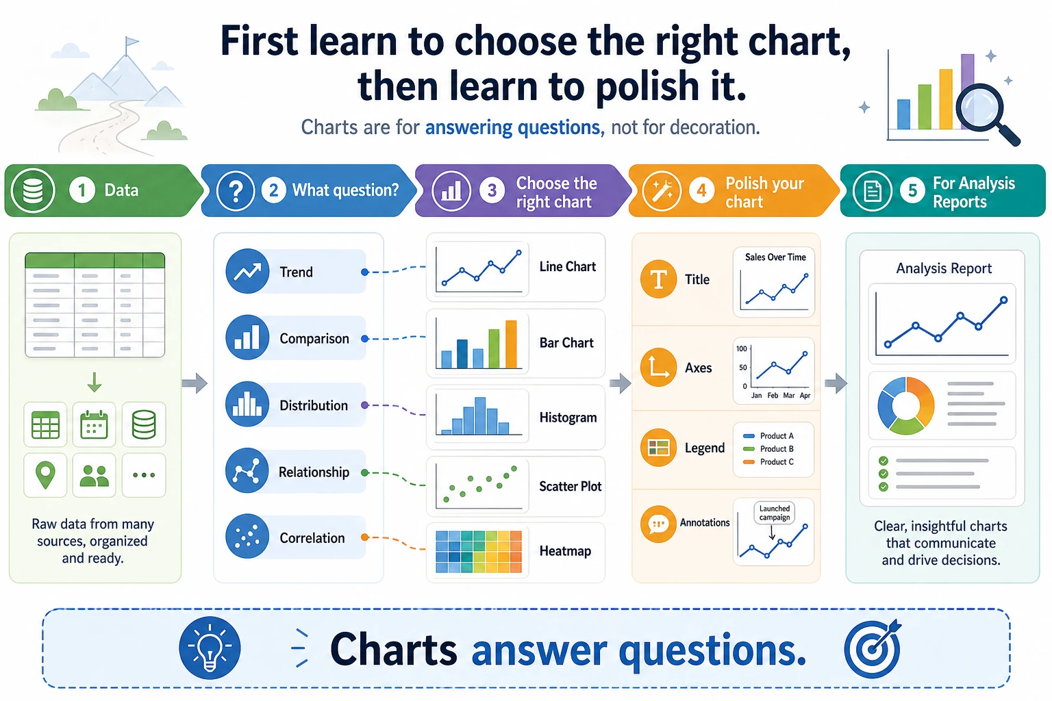
Use this decision first:
| What you want to show | Start with |
|---|---|
| change over time | line chart |
| category comparison | bar chart |
| distribution | histogram or box plot |
| relationship between two numbers | scatter plot |
| correlation matrix | heatmap |
After the chart type is right, then polish title, axes, legend, colors, and annotation.
Run One Chart Once
Section titled “Run One Chart Once”Create visual_first_loop.py and run it after installing pandas and matplotlib.
import pandas as pdimport matplotlib.pyplot as plt
sales = pd.DataFrame(    {        "month": ["2026-01", "2026-02", "2026-03", "2026-04"],        "amount": [120, 180, 160, 220],    })
ax = sales.plot(x="month", y="amount", marker="o", legend=False)ax.set_title("Monthly sales")ax.set_xlabel("Month")ax.set_ylabel("Amount")plt.tight_layout()plt.savefig("sales_trend.png", dpi=150)
print("saved: sales_trend.png")
Expected output:
saved: sales_trend.pngOpen the image and check one thing: can a reader see the trend within three seconds?
Learn in This Order
Section titled “Learn in This Order”| Order | Read | What to practice |
|---|---|---|
| 1 | 3.4.2 Matplotlib Basics | Figure, Axes, line/bar/scatter |
| 2 | 3.4.3 Seaborn Statistical Visualization | faster exploratory charts |
| 3 | 3.4.5 Visualization Best Practices | chart choice, labels, color, misleading charts |
| 4 | 3.4.4 Plotly Interactive Visualization | interactive charts when the project needs them |
Evidence to Keep
Section titled “Evidence to Keep”Keep this page’s proof of learning as a small evidence card:
- Question
- what comparison, distribution, trend, or relationship the chart answers
- Chart Choice
- line, bar, scatter, histogram, box, heatmap, or interactive dashboard
- Artifact
- saved chart image/html plus the data slice used
- Failure Check
- misleading scale, overloaded chart, wrong aggregation, or missing labels
- Expected Output
- chart artifact with one sentence explaining the insight
Pass Check
Section titled “Pass Check”You pass this subchapter when you can create 4 useful charts from one dataset and explain why each chart type was chosen.
Check reasoning and explanation
- A passing answer starts from the question, identifies the table/DataFrame or query needed, and keeps the cleaning step reproducible.
- The evidence should include a small output sample, a plot or SQL result when relevant, and one sentence interpreting what changed.
- A good self-check names one data-quality risk such as missing values, duplicate rows, wrong joins, misleading aggregation, or an unreadable chart.