
3.6.1 Hands-on Project: Exploratory Data Analysis (EDA)
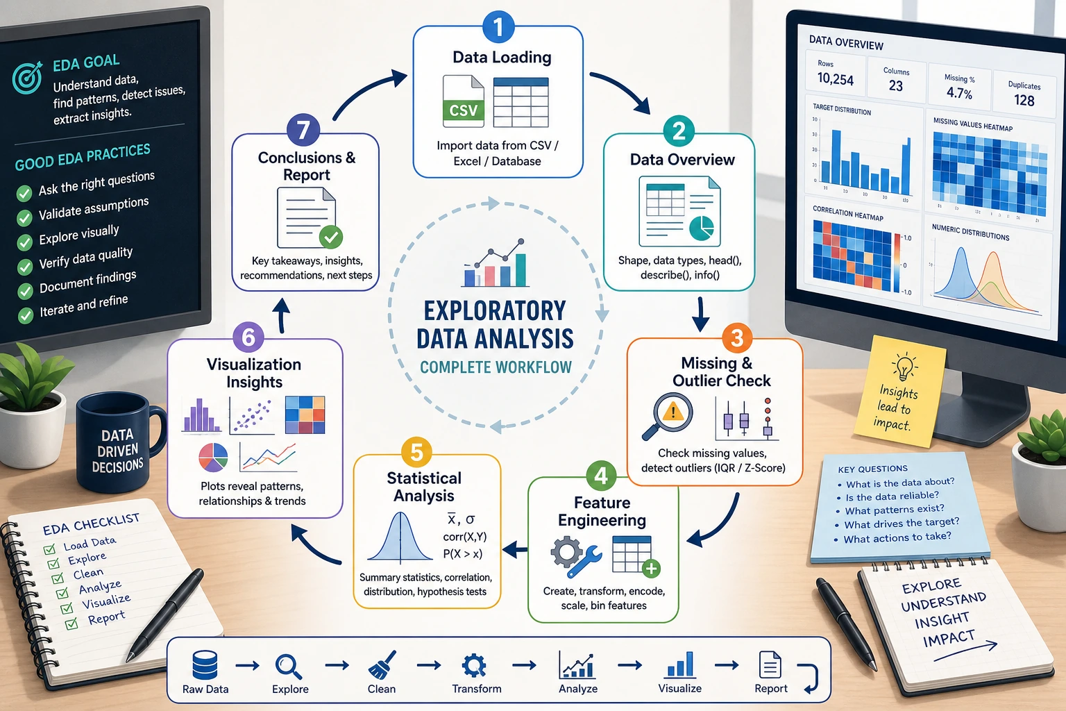
First, build a map
Section titled “First, build a map”When doing an EDA project for the first time, the safest sequence is not “draw all the charts first,” but to first understand:
flowchart LR A["First get familiar with the data"] --> B["Then clean it"] B --> C["Then do statistics and grouped analysis"] C --> D["Then visualize to verify conclusions"] D --> E["Finally write clear conclusions"]So what this project really trains is:
- not whether you can make a few charts
- but whether you can turn “look at the data -> reach conclusions” into a complete chain
Project overview
Section titled “Project overview”Exploratory Data Analysis (EDA) is the first step in a data science project — before modeling, use statistics and visualization to “get to know” the data.
flowchart LR    A["Get the data"] --> B["Initial understanding"]    B --> C["Data cleaning"]    C --> D["Statistical analysis"]    D --> E["Visual exploration"]    E --> F["Draw conclusions & write report"]
    style A fill:#e3f2fd,stroke:#1565c0,color:#333    style F fill:#e8f5e9,stroke:#2e7d32,color:#333
A beginner-friendly overall analogy
Section titled “A beginner-friendly overall analogy”You can think of EDA as:
- a site survey before actually building a model
You wouldn’t start working before you’ve clearly seen the terrain. Likewise, in a data project, you shouldn’t rush into modeling before you’ve understood:
- the distribution
- missing values
- outliers
- relationships between variables
Skills you will practice
Section titled “Skills you will practice”| Skill | Corresponding chapter |
|---|---|
| Pandas data loading and cleaning | Chapter 3 |
| Statistical summaries and grouped aggregation | Chapter 3 |
| Matplotlib / Seaborn visualization | Chapter 4 |
| NumPy numerical computation | Chapter 2 |
Project deliverable
Section titled “Project deliverable”After finishing, you will have a complete EDA report (a Jupyter Notebook) that includes a data overview, cleaning process, statistical findings, and visual charts.
Project setup
Section titled “Project setup”Dataset selection
Section titled “Dataset selection”We will use Seaborn’s built-in tips dataset — a record of tips from a U.S. restaurant.
| Field | Meaning | Type |
|---|---|---|
total_bill | Total bill amount (USD) | Continuous |
tip | Tip amount (USD) | Continuous |
sex | Customer gender | Categorical |
smoker | Smoker or not | Categorical |
day | Day of the week | Categorical |
time | Lunch/Dinner | Categorical |
size | Party size | Discrete |
Environment setup
Section titled “Environment setup”# Import all required librariesimport numpy as npimport pandas as pdimport matplotlib.pyplot as pltimport seaborn as sns
# Configure Chinese font display (macOS)plt.rcParams['font.sans-serif'] = ['Arial Unicode MS']# Windows users can use: plt.rcParams['font.sans-serif'] = ['SimHei']plt.rcParams['axes.unicode_minus'] = False
# Set Seaborn themesns.set_theme(style="whitegrid", font_scale=1.1)
# Show plots inline in Jupyter# %matplotlib inlineLoad the data
Section titled “Load the data”# Load the built-in datasettips = sns.load_dataset("tips")
# First look: see what the data looks likeprint(f"Dataset size: {tips.shape[0]} rows × {tips.shape[1]} columns")tips.head(10)Example output:
The dataset has these columns: total_bill, tip, sex, smoker, day, time, and size.
Two sample rows are enough for a first read:
| Row | What it says |
|---|---|
| 0 | A Sunday dinner table of 2, total bill 16.99, tip 1.01, non-smoker |
| 1 | A Sunday dinner table of 3, total bill 10.34, tip 1.66, non-smoker |
Data overview — start with “getting familiar”
Section titled “Data overview — start with “getting familiar””The first step in EDA is not to rush into charts, but to first understand: How big is the dataset? What type is each column? Are there missing values?
What should you ask first when looking at data?
Section titled “What should you ask first when looking at data?”The 4 most important questions are:
- How large is the table?
- What type is each column?
- Are there any missing values?
- What does the target analysis field look like?
If you can answer these 4 questions clearly first, many later analysis steps will go much more smoothly.
Basic information
Section titled “Basic information”# Data types and non-null countstips.info()The output tells you:
- 7 columns, 244 rows
- No missing values (all Non-Null Count values are 244)
total_billandtipare float64sex,smoker,day, andtimeare category
# Statistical summarytips.describe()| total_bill | tip | size | |
|---|---|---|---|
| count | 244.0 | 244.0 | 244.0 |
| mean | 19.79 | 3.00 | 2.57 |
| std | 8.90 | 1.38 | 0.95 |
| min | 3.07 | 1.00 | 1.00 |
| 25% | 13.35 | 2.00 | 2.00 |
| 50% | 17.80 | 2.90 | 2.00 |
| 75% | 24.13 | 3.56 | 3.00 |
| max | 50.81 | 10.00 | 6.00 |
Findings:
- Average bill is about 19.79 USD, and average tip is about 3.00 USD
- Tips range from 1 USD to 10 USD
- Most parties have 2 people
Distribution of categorical variables
Section titled “Distribution of categorical variables”# Count each value for categorical variablesfor col in ['sex', 'smoker', 'day', 'time']: print(f"\n--- {col} ---") print(tips[col].value_counts())Findings:
- There are more male customers than female customers (157 vs 87)
- There are more non-smokers than smokers (151 vs 93)
- Saturday and Sunday have the most records
- Dinner data is far more common than lunch data (176 vs 68)
Create derived features
Section titled “Create derived features”Good analysts create new features to help discover patterns:
# Tip percentage = tip / total billtips['tip_pct'] = (tips['tip'] / tips['total_bill'] * 100).round(2)
# Per-person spendingtips['per_person'] = (tips['total_bill'] / tips['size']).round(2)
tips[['total_bill', 'tip_pct', 'per_person']].head()| Row | total_bill | tip_pct | per_person |
|---|---|---|---|
| 0 | 16.99 | 5.94 | 8.50 |
| 1 | 10.34 | 16.05 | 3.45 |
| 2 | 21.01 | 16.66 | 7.00 |
Data cleaning — check data quality
Section titled “Data cleaning — check data quality”This dataset is quite clean, but in real projects this step usually takes the most time. We will still go through the full process:
Missing value check
Section titled “Missing value check”# Missing value statisticsmissing = tips.isnull().sum()print("Missing value statistics:")print(missing[missing > 0] if missing.sum() > 0 else "No missing values ✓")Duplicate value check
Section titled “Duplicate value check”# Completely duplicated rowsdup_count = tips.duplicated().sum()print(f"Duplicate rows: {dup_count}")
if dup_count > 0: tips = tips.drop_duplicates() print(f"Duplicates removed, {len(tips)} rows remaining")Outlier detection
Section titled “Outlier detection”Use the IQR (interquartile range) method to detect outliers:
def detect_outliers_iqr(df, column):    """Detect outliers using the IQR method"""    Q1 = df[column].quantile(0.25)    Q3 = df[column].quantile(0.75)    IQR = Q3 - Q1    lower = Q1 - 1.5 * IQR    upper = Q3 + 1.5 * IQR
    outliers = df[(df[column] < lower) | (df[column] > upper)]    return outliers, lower, upper
# Check outliers in each numeric columnfor col in ['total_bill', 'tip', 'tip_pct']: outliers, lower, upper = detect_outliers_iqr(tips, col) print(f"\n{col}: normal range [{lower:.2f}, {upper:.2f}], {len(outliers)} outliers") if len(outliers) > 0: print(f" Outlier examples: {outliers[col].values[:5]}")Statistical analysis — let the numbers speak
Section titled “Statistical analysis — let the numbers speak”Core statistical metrics
Section titled “Core statistical metrics”# Tip statistics grouped by gendertips.groupby('sex')[['total_bill', 'tip', 'tip_pct']].agg(['mean', 'median', 'std'])# Group by dayday_stats = tips.groupby('day')[['total_bill', 'tip']].agg(['mean', 'count'])print(day_stats)Cross analysis
Section titled “Cross analysis”# Pivot table: average tip percentage by gender and smoker statuspivot = tips.pivot_table( values='tip_pct', index='sex', columns='smoker', aggfunc='mean').round(2)
print("Tip percentage (%):")print(pivot)Example output:
| smoker | No | Yes |
|---|---|---|
| Female | 15.69 | 18.22 |
| Male | 16.07 | 15.28 |
Finding: Female smokers have the highest tip percentage, while male smokers have the lowest.
Correlation analysis
Section titled “Correlation analysis”# Correlation coefficients for numeric columnsnumeric_cols = ['total_bill', 'tip', 'size', 'tip_pct', 'per_person']corr_matrix = tips[numeric_cols].corr().round(3)print(corr_matrix)Key findings:
total_billandtipare positively correlated (about 0.68) → the more you spend, the more tip you leavetotal_billandtip_pctare negatively correlated (about -0.09) → as spending increases, the tip percentage slightly decreasessizeandtotal_billare positively correlated (about 0.60) → the larger the party, the higher the spending
A beginner-friendly analysis order to remember
Section titled “A beginner-friendly analysis order to remember”When doing EDA, a safer order is usually:
- First look at single-variable distributions
- Then look at counts of categorical variables
- Then look at relationships between two variables
- Finally do combined analysis and multi-dimensional comparisons
This is often easier to follow than jumping directly into complex facet plots at the beginning.
Visual exploration — let the data speak
Section titled “Visual exploration — let the data speak”Numeric distributions
Section titled “Numeric distributions”fig, axes = plt.subplots(1, 3, figsize=(15, 4))
# Total bill distributionaxes[0].hist(tips['total_bill'], bins=20, color='steelblue', edgecolor='white')axes[0].set_title('Total Bill Distribution')axes[0].set_xlabel('Amount (USD)')axes[0].set_ylabel('Frequency')
# Tip distributionaxes[1].hist(tips['tip'], bins=20, color='coral', edgecolor='white')axes[1].set_title('Tip Distribution')axes[1].set_xlabel('Amount (USD)')
# Tip percentage distributionaxes[2].hist(tips['tip_pct'], bins=20, color='mediumseagreen', edgecolor='white')axes[2].set_title('Tip Percentage (%) Distribution')axes[2].set_xlabel('Percentage')
plt.tight_layout()plt.savefig('01_distribution.png', dpi=150, bbox_inches='tight')plt.show()Interpretation: Total bill and tip both have right-skewed distributions — most people spend between 10 and 25 USD, and most tips are between 2 and 4 USD.
Visualization of categorical variables
Section titled “Visualization of categorical variables”fig, axes = plt.subplots(2, 2, figsize=(12, 10))
# Count by daysns.countplot(data=tips, x='day', order=['Thur', 'Fri', 'Sat', 'Sun'], palette='Blues_d', ax=axes[0, 0])axes[0, 0].set_title('Customer Count by Day')
# By time of daysns.countplot(data=tips, x='time', palette='Set2', ax=axes[0, 1])axes[0, 1].set_title('Lunch vs Dinner')
# By gendersns.countplot(data=tips, x='sex', palette='Pastel1', ax=axes[1, 0])axes[1, 0].set_title('Customer Gender Distribution')
# By smoking statussns.countplot(data=tips, x='smoker', palette='Pastel2', ax=axes[1, 1])axes[1, 1].set_title('Smoker vs Non-smoker')
plt.tight_layout()plt.savefig('02_categorical.png', dpi=150, bbox_inches='tight')plt.show()Exploring key relationships
Section titled “Exploring key relationships”Relationship between bill and tip
Section titled “Relationship between bill and tip”fig, axes = plt.subplots(1, 2, figsize=(14, 5))
# Scatter plot: bill vs tipsns.scatterplot(data=tips, x='total_bill', y='tip', hue='time', style='smoker', s=80, alpha=0.7, ax=axes[0])axes[0].set_title('Total Bill vs Tip')axes[0].set_xlabel('Total Bill (USD)')axes[0].set_ylabel('Tip (USD)')
# Regression linesns.regplot(data=tips, x='total_bill', y='tip', scatter_kws={'alpha': 0.5}, line_kws={'color': 'red'}, ax=axes[1])axes[1].set_title('Total Bill vs Tip (with trend line)')axes[1].set_xlabel('Total Bill (USD)')axes[1].set_ylabel('Tip (USD)')
plt.tight_layout()plt.savefig('03_bill_vs_tip.png', dpi=150, bbox_inches='tight')plt.show()Interpretation: As the bill amount increases, the tip also increases, showing a clear linear trend. You can also see some “outliers” — for example, someone spent more than 40 USD but only left a 1.5 USD tip.
Comparing tips across different scenarios
Section titled “Comparing tips across different scenarios”fig, axes = plt.subplots(1, 3, figsize=(16, 5))
# Compare tip by daysns.boxplot(data=tips, x='day', y='tip', order=['Thur', 'Fri', 'Sat', 'Sun'], palette='coolwarm', ax=axes[0])axes[0].set_title('Tip Distribution by Day')
# Compare by time of daysns.violinplot(data=tips, x='time', y='tip', palette='Set2', ax=axes[1])axes[1].set_title('Tip Distribution: Lunch vs Dinner')
# Compare by party sizesns.boxplot(data=tips, x='size', y='tip', palette='YlOrRd', ax=axes[2])axes[2].set_title('Tip by Party Size')
plt.tight_layout()plt.savefig('04_tip_comparison.png', dpi=150, bbox_inches='tight')plt.show()Interpretation:
- Sunday has the highest median tip
- Dinner tips are overall higher than lunch tips (because dinner spending is higher)
- Larger parties give higher tips
Correlation heatmap
Section titled “Correlation heatmap”plt.figure(figsize=(8, 6))
# Draw heatmapsns.heatmap( corr_matrix, annot=True, # show values fmt='.2f', # keep two decimal places cmap='RdBu_r', # red-blue palette center=0, # center at 0 square=True, # square cells linewidths=0.5 # grid line width)plt.title('Correlation Matrix of Numeric Variables')plt.tight_layout()plt.savefig('05_correlation.png', dpi=150, bbox_inches='tight')plt.show()Combined multi-dimensional analysis
Section titled “Combined multi-dimensional analysis”# FacetGrid: look at the bill-tip relationship by gender and smoking statusg = sns.FacetGrid(tips, col='sex', row='smoker', height=4, aspect=1.2, margin_titles=True)g.map_dataframe(sns.scatterplot, x='total_bill', y='tip', hue='time', alpha=0.7)g.add_legend()g.set_axis_labels('Total Bill (USD)', 'Tip (USD)')g.fig.suptitle('Faceted by Gender × Smoking Status', y=1.02, fontsize=14)plt.savefig('06_facet.png', dpi=150, bbox_inches='tight')plt.show()Analysis conclusions
Section titled “Analysis conclusions”After a complete EDA, we can draw the following conclusions:
Key findings
Section titled “Key findings” root((EDA Key Findings)) Spending patterns Most spending is between 10-25 USD Dinner spending is higher than lunch Weekend has the most customers Tip patterns Average tip is about 15-16% Higher spending means higher tip amount But tip percentage slightly decreases Group differences Male spending is slightly higher than female Difference between smokers and non-smokers is small Party size is a key factorSpecific conclusions
Section titled “Specific conclusions”- Bill and tip are positively correlated: the higher the total bill, the higher the tip amount (correlation coefficient 0.68), but the tip percentage decreases slightly
- Dinner spending is higher than lunch: both average spending and average tip are significantly higher at dinner
- Weekends are peak periods: Saturday and Sunday have the most customers and the highest spending
- Party size matters a lot: the larger the party, the higher the total bill (correlation coefficient 0.60)
- Gender differences are small: men and women do not differ much in tip percentage (about 1 percentage point)
- Smoking status has limited impact: whether someone smokes does not significantly affect tip percentage
Recommendations for the restaurant
Section titled “Recommendations for the restaurant”- Weekend dinner is the key revenue period, so service quality should be ensured
- Encourage larger parties to dine in (more people usually means more spending and more tips)
- Consider lunch set meals to increase midday traffic
A beginner-friendly way to write conclusions
Section titled “A beginner-friendly way to write conclusions”Good EDA conclusions are usually not:
- I drew a lot of charts
Instead, they should answer:
- What did I find?
- Which charts and statistics support this?
- What does this mean for the business?
This order is especially important because it turns your Notebook from “many charts” into “a report with real insights.”
Code integration — complete analysis script
Section titled “Code integration — complete analysis script”Combine the above analysis into a clear, structured script:
"""Tips dataset - Exploratory Data Analysis (EDA)==============================================Analysis goal: Understand the factors that influence restaurant spending and tipping"""
# ========== 1. Imports and configuration ==========import numpy as npimport pandas as pdimport matplotlib.pyplot as pltimport seaborn as sns
plt.rcParams['font.sans-serif'] = ['Arial Unicode MS']plt.rcParams['axes.unicode_minus'] = Falsesns.set_theme(style="whitegrid", font_scale=1.1)

# ========== 2. Load data ==========tips = sns.load_dataset("tips")print(f"Dataset: {tips.shape[0]} rows × {tips.shape[1]} columns\n")

# ========== 3. Data overview ==========print("=== Basic information ===")tips.info()print("\n=== Statistical summary ===")print(tips.describe().round(2))

# ========== 4. Feature engineering ==========tips['tip_pct'] = (tips['tip'] / tips['total_bill'] * 100).round(2)tips['per_person'] = (tips['total_bill'] / tips['size']).round(2)

# ========== 5. Data quality check ==========print(f"\nMissing values: {tips.isnull().sum().sum()}")print(f"Duplicate rows: {tips.duplicated().sum()}")

# ========== 6. Statistical analysis ==========print("\n=== Grouped by gender ===")print(tips.groupby('sex')[['total_bill', 'tip', 'tip_pct']].mean().round(2))
print("\n=== Grouped by day ===")print(tips.groupby('day')[['total_bill', 'tip']].agg(['mean', 'count']).round(2))
print("\n=== Correlation matrix ===")print(tips[['total_bill', 'tip', 'size', 'tip_pct']].corr().round(3))

# ========== 7. Visualization ==========# See the visualization code in Section 5 above# Running each part step by step in Jupyter Notebook works best
print("\nAnalysis complete!")
Advanced challenges
Section titled “Advanced challenges”After completing the basic EDA, try these challenges:
Challenge 1: Use a different dataset
Section titled “Challenge 1: Use a different dataset”Do EDA with Seaborn’s built-in diamonds dataset:
diamonds = sns.load_dataset("diamonds")print(diamonds.shape) # 53940 rows × 10 columnsprint(diamonds.head())Analysis directions:
- Which factors affect diamond price?
- How do cut, color, and clarity affect price?
- Is carat and price a linear relationship?
Challenge 2: Automate the EDA report
Section titled “Challenge 2: Automate the EDA report”Try using code to automatically generate a simple report:
def quick_eda(df, title="EDA Report"):    """Quickly generate an EDA report"""    print(f"{'='*50}")    print(f"  {title}")    print(f"{'='*50}")
    # Basic information    print(f"\n📊 Dataset size: {df.shape[0]} rows × {df.shape[1]} columns")
    # Data type statistics    print(f"\n📋 Data types:")    print(df.dtypes.value_counts().to_string())
    # Missing values    missing = df.isnull().sum()    if missing.sum() > 0:        print(f"\n⚠️ Missing values:")        print(missing[missing > 0].to_string())    else:        print(f"\n✅ No missing values")
    # Numeric column statistics    num_cols = df.select_dtypes(include=[np.number]).columns    if len(num_cols) > 0:        print(f"\n📈 Numeric column statistics:")        print(df[num_cols].describe().round(2).to_string())
    # Categorical column statistics    cat_cols = df.select_dtypes(include=['object', 'category']).columns    for col in cat_cols:        print(f"\n🏷️ Distribution of {col}:")        print(df[col].value_counts().head(5).to_string())
    return None
# Use itquick_eda(tips, "Tips Dataset EDA")
Challenge 3: Make an interactive version with Plotly
Section titled “Challenge 3: Make an interactive version with Plotly”If you learned Plotly in Chapter 4, try replacing static charts with interactive ones:
import plotly.express as px
# Interactive scatter plotfig = px.scatter(    tips, x='total_bill', y='tip',    color='time', size='size',    hover_data=['sex', 'smoker', 'day'],    title='Total Bill vs Tip (Interactive)')fig.show()
EDA checklist
Section titled “EDA checklist”After finishing the project, check the following:
| Check item | Completed |
|---|---|
| Load the data and view the first few rows | ☐ |
Check info() and describe() | ☐ |
| Check missing values and duplicate values | ☐ |
| Detect outliers | ☐ |
| Create meaningful derived features | ☐ |
| Plot distributions of numeric variables | ☐ |
| Plot count charts for categorical variables | ☐ |
| Explore relationships between variables (scatter plots, box plots) | ☐ |
| Plot a correlation heatmap | ☐ |
| Multi-dimensional cross analysis (facet plots, pivot tables) | ☐ |
| Write 3–5 valuable findings | ☐ |
| Provide data-driven recommendations | ☐ |
A ready-to-use EDA checklist for beginners
Section titled “A ready-to-use EDA checklist for beginners”When doing an EDA project for the first time, the safest checklist is usually:
- Is the data overview clear?
- Have missing values and outliers been explained?
- Have single-variable, two-variable, and grouped analyses each been done at least once?
- Does each key chart have a clear conclusion?
- Have the findings been translated into business recommendations?
If you can do these 5 things well, this project is no longer just a “plotting exercise,” but a real analysis report.
Project reference and review notes
- There is no single numeric answer for an EDA project. A strong submission includes raw data location, data dictionary, cleaning log, summary statistics, at least three question-driven visuals, conclusions, and limitations.
- Every visual should answer a named question and point back to the cleaned dataset. If a chart cannot be tied to a question, remove it or rewrite the question.
- The final README should let another person reproduce the analysis and understand which decisions were judgment calls.
Version roadmap suggestions
Section titled “Version roadmap suggestions”| Version | Goal | Delivery focus |
|---|---|---|
| Basic version | Get the minimal loop working | Can input, process, and output, while keeping one set of examples |
| Standard version | Build a presentable project | Add configuration, logs, error handling, README, and screenshots |
| Challenge version | Get close to portfolio quality | Add evaluation, comparison experiments, failure sample analysis, and next-step roadmap |
It is recommended to complete the basic version first; don’t aim for everything at once at the beginning. Each time you improve a version, write into the README “what new capability was added, how it was validated, and what problems remain.”
Evidence to Keep
Section titled “Evidence to Keep”Keep this page’s proof of learning as a small evidence card:
- Analysis Goal
- business/data question and success criterion
- Data Evidence
- source, cleaning notes, features, and chart/table outputs
- Result
- insight, metric, dashboard, or report section
- Failure Check
- dirty data, biased sample, wrong aggregation, or unreproducible notebook
- Expected Output
- reproducible analysis folder with data, charts, and a short report