
3.4.4 Interactive Visualization
Learning Objectives
Section titled “Learning Objectives”- Understand the difference between static charts and interactive charts
- Learn to use Plotly Express for quick charting
- Understand the concept of interactive dashboards
First, build a mental map
Section titled “First, build a mental map”Plotly is best understood through the question: “When do I want users to explore the chart themselves?”
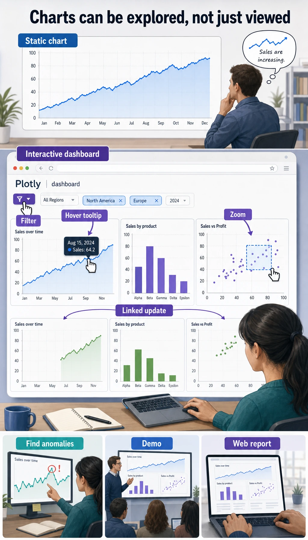
So what this section really tries to answer is:
- What extra capability do interactive charts provide beyond static charts?
- When are they a plus, and when do they feel unnecessary?
Why do we need interactive charts?
Section titled “Why do we need interactive charts?”| Comparison | Static charts (Matplotlib/Seaborn) | Interactive charts (Plotly) |
|---|---|---|
| Mouse hover | Not supported | Shows detailed data |
| Zoom and drag | Not supported | Freely zoom and pan |
| Data filtering | Not supported | Click legends to hide/show |
| Export | Save as image | Image + HTML page |
| Use cases | Papers, reports | Data exploration, web display |
flowchart LR    A["Does my chart need<br/>interactivity?"] --> B{"Use case"}    B -->|"Paper / report / PPT"| C["Matplotlib / Seaborn<br/>Static charts are enough"]    B -->|"Data exploration / demo"| D["Plotly<br/>Interactive is more convenient"]    B -->|"Website / dashboard"| E["Plotly + Dash<br/>Interactive app"]
    style C fill:#e3f2fd,stroke:#1565c0,color:#333    style D fill:#e8f5e9,stroke:#2e7d32,color:#333    style E fill:#fff3e0,stroke:#e65100,color:#333
A better analogy for beginners
Section titled “A better analogy for beginners”You can think of Plotly as:
- A chart you can hold in your hands and inspect, zoom into, and filter yourself
A static chart is more like:
- A printed poster
An interactive chart is more like:
- A digital map with zoom and filter buttons
So it is best for:
- Readers who want to keep exploring
Not for forcing interactivity into every single scenario.
Installation and imports
Section titled “Installation and imports”# Install# python -m pip install --upgrade plotly
# Plotly Express: quick charting (recommended)import plotly.express as px
# Plotly Graph Objects: lower-level controlimport plotly.graph_objects as go
import pandas as pdimport numpy as npQuick start with Plotly Express
Section titled “Quick start with Plotly Express”Plotly Express is Plotly’s high-level interface. You can create beautiful interactive charts with just one line of code.
The safest learning order for Plotly beginners
Section titled “The safest learning order for Plotly beginners”A good order is usually:
- Start with
px.scatter(),px.line(), andpx.bar()to get familiar with basic interactions - Then look at heatmaps, 3D charts, and animated charts
- Finally, study dashboards and web display
This is much less confusing than jumping straight into Dash at the beginning.
Scatter plot
Section titled “Scatter plot”# Use a built-in datasetdf = px.data.iris()
fig = px.scatter(df, x="sepal_width", y="sepal_length", color="species", # Color by species size="petal_length", # Control point size by petal length hover_data=["petal_width"], # Show petal width on hover title="Iris Dataset - Interactive Scatter Plot")fig.show()After running this, you will see a chart that supports hovering, zooming, and dragging!
Line chart
Section titled “Line chart”df = px.data.gapminder()# Filter data for China, the United States, and Japancountries = df[df["country"].isin(["China", "United States", "Japan"])]
fig = px.line(countries, x="year", y="gdpPercap", color="country", title="Changes in GDP per Capita for China, the US, and Japan", labels={"gdpPercap": "GDP per Capita (USD)", "year": "Year", "country": "Country"})fig.show()Bar chart
Section titled “Bar chart”df = px.data.tips()
fig = px.bar(df, x="day", y="total_bill", color="sex", barmode="group", # "group" for grouped, "stack" for stacked title="Daily Spending (Grouped by Sex)", labels={"total_bill": "Bill Amount", "day": "Day", "sex": "Sex"})fig.show()Histogram
Section titled “Histogram”df = px.data.tips()
fig = px.histogram(df, x="total_bill", color="time", nbins=20, marginal="box", # Marginal plot: "box", "violin", "rug" title="Distribution of Bill Amounts (with Marginal Box Plot)")fig.show()Box plot
Section titled “Box plot”df = px.data.tips()
fig = px.box(df, x="day", y="total_bill", color="smoker", notched=True, # Notched box plot title="Distribution of Daily Spending (by Smoking Status)")fig.show()Pie / donut chart
Section titled “Pie / donut chart”# Pie chartfig = px.pie(df, names="day", values="total_bill", title="Proportion of Spending by Day", hole=0.3) # hole > 0 turns it into a donut chartfig.show()Advanced charts
Section titled “Advanced charts”Heatmap
Section titled “Heatmap”# Compute correlation coefficientsdf = px.data.iris()numeric_cols = df.select_dtypes(include="number")corr = numeric_cols.corr()
fig = px.imshow(corr, text_auto=".2f", color_continuous_scale="RdBu_r", title="Correlation Heatmap of Iris Features")fig.show()3D scatter plot
Section titled “3D scatter plot”df = px.data.iris()
fig = px.scatter_3d(df, x="sepal_length", y="sepal_width", z="petal_length", color="species", title="Iris 3D Scatter Plot (rotatable!)")fig.show()You can drag the mouse to rotate this 3D chart and view the data from different angles.
Animated chart
Section titled “Animated chart”df = px.data.gapminder()
fig = px.scatter(df, x="gdpPercap", y="lifeExp", size="pop", color="continent", hover_name="country", animation_frame="year", # Play animation by year animation_group="country", log_x=True, range_x=[100, 100000], range_y=[25, 90], title="Development Trajectories by Country (1952-2007)")fig.show()Click the play button to see how each country changes over time. This is the famous Hans Rosling bubble chart.
Chart customization
Section titled “Chart customization”Update layout
Section titled “Update layout”fig = px.scatter(px.data.iris(), x="sepal_width", y="sepal_length", color="species")
fig.update_layout( title=dict(text="Custom Title", font=dict(size=20)), xaxis_title="Sepal Width (cm)", yaxis_title="Sepal Length (cm)", template="plotly_white", # Theme template width=800, height=500, legend_title="Species")
fig.show()Common templates
Section titled “Common templates”| Template name | Style |
|---|---|
"plotly" | Default blue background |
"plotly_white" | White background (recommended) |
"plotly_dark" | Dark background |
"ggplot2" | R ggplot style |
"simple_white" | Minimal white background |
A simple decision table worth remembering first
Section titled “A simple decision table worth remembering first”| Your goal | Safer first choice |
|---|---|
| Make charts for a paper or report | Prefer static charts |
| Explore data details yourself | Plotly is a good fit |
| Build a web demo for others | Plotly is a good fit |
| Just want it to “look cooler” | Pause and think whether it is really necessary |
This table is especially useful for beginners because it brings “interactive charts are cool” back to a question of use case.
Saving charts
Section titled “Saving charts”# Save as interactive HTMLfig.write_html("my_chart.html")
# Save as a static image (requires kaleido)# python -m pip install --upgrade kaleidofig.write_image("my_chart.png", scale=2)fig.write_image("my_chart.svg")Plotly vs Matplotlib vs Seaborn
Section titled “Plotly vs Matplotlib vs Seaborn”| Feature | Matplotlib | Seaborn | Plotly |
|---|---|---|---|
| Interactivity | No | No | Strong |
| Visual appeal | Moderate | Good | Good |
| Learning curve | Medium | Low | Low |
| Customization | Very strong | Medium | Strong |
| Output formats | Image/PDF | Image/PDF | HTML/Image |
| Best for | Papers / fine control | Fast statistical charts | Data exploration / presentation |
Introduction to interactive dashboards
Section titled “Introduction to interactive dashboards”In real-world work, you may need to combine multiple interactive charts into a single dashboard.
Common tools:
| Tool | Features |
|---|---|
| Plotly Dash | Built with Python code, very powerful |
| Streamlit | Easiest to use; you can build an app with just a few lines of code |
| Gradio | Designed for AI model demos |
| Panel | Good integration with the Jupyter ecosystem |
A simple Dash example (just for awareness):
# python -m pip install --upgrade dashfrom dash import Dash, html, dccimport plotly.express as px
app = Dash(__name__)
df = px.data.gapminder().query("year == 2007")fig = px.scatter(df, x="gdpPercap", y="lifeExp", size="pop",                 color="continent", hover_name="country", log_x=True)
app.layout = html.Div([    html.H1("World Development Indicators Dashboard"),    dcc.Graph(figure=fig)])
# Run: python app.py, then open http://127.0.0.1:8050# app.run(debug=True)Evidence to Keep
Section titled “Evidence to Keep”Keep this page’s proof of learning as a small evidence card:
- Question
- what comparison, distribution, trend, or relationship the chart answers
- Chart Choice
- line, bar, scatter, histogram, box, heatmap, or interactive dashboard
- Artifact
- saved chart image/html plus the data slice used
- Failure Check
- misleading scale, overloaded chart, wrong aggregation, or missing labels
- Expected Output
- chart artifact with one sentence explaining the insight
Summary
Section titled “Summary”| Plotly Express function | Chart type |
|---|---|
px.scatter() | Scatter plot |
px.line() | Line chart |
px.bar() | Bar chart |
px.histogram() | Histogram |
px.box() | Box plot |
px.pie() | Pie chart |
px.imshow() | Heatmap |
px.scatter_3d() | 3D scatter plot |
The core advantage of Plotly is interactivity—hover to inspect data, zoom to look at details, and use animation to show changes over time. It is very useful for data exploration and presenting results.
What should you take away from this section?
Section titled “What should you take away from this section?”- The core value of
Plotlyis not being flashy, but letting readers continue exploring the data - Interactive charts are best for data exploration, web display, and presentations
- When learning for the first time, mastering
px.scatter / px.line / px.baris enough
Hands-on exercises
Section titled “Hands-on exercises”Exercise 1: Interactive exploration
Section titled “Exercise 1: Interactive exploration”# Load the gapminder dataset# 1. Use px.scatter to plot the relationship between gdpPercap and lifeExp for each country in 2007# - Use pop for point size, continent for color# - Show country on hover# 2. Use px.line to plot China's lifeExp changes from 1952 to 2007Exercise 2: Data distribution
Section titled “Exercise 2: Data distribution”# Load the tips dataset# 1. Use px.histogram to plot the distribution of bill amounts, and add a marginal plot with marginal="violin"# 2. Use px.box to compare bill amounts by dayExercise 3: Animated chart
Section titled “Exercise 3: Animated chart”# Use the gapminder dataset to create an animated scatter plot# Show changes in gdpPercap vs lifeExp across countries from 1952 to 2007# Use animation_frame="year"Reference implementation and walkthrough
- For the Gapminder-style scatter plot, map x, y, size, color, and hover text deliberately. The hover fields should help answer the question, not just show every column.
- For a country or product trend line, sort by time and check that the x-axis is a date or ordered year field. Unsorted time data can draw misleading zigzags.
- Animated charts need a stable question. If the animation distracts from comparison, add a static summary or a final-frame note.