
3.4.3 Seaborn Statistical Visualization
Learning Objectives
Section titled “Learning Objectives”- Understand the relationship between Seaborn and Matplotlib
- Master distribution plots, relational plots, and categorical plots
- Learn to draw heatmaps and correlation matrices
- Use FacetGrid for faceting plots
First, Build a Map
Section titled “First, Build a Map”For beginners, the best way to understand Seaborn is not by memorizing its function list, but by first seeing the 4 problem types it handles best:
flowchart LR A["Distribution"] --> B["histplot / kdeplot"] C["Relationship"] --> D["scatterplot / lineplot / pairplot"] E["Categorical comparison"] --> F["boxplot / violinplot / barplot / countplot"] G["Matrix relationships"] --> H["heatmap"]So what this section really aims to solve is:
- When you are doing EDA, which plot should you use first?
- Why is
Seabornmore suitable than plainMatplotlibfor quick exploration?
What Is Seaborn?
Section titled “What Is Seaborn?”If you think of Matplotlib as brushes and paint, then Seaborn is a brush set + palette + templates.
flowchart LR    A["Matplotlib<br/>Basic plotting tools"] -->|"Seaborn wraps it"| B["Seaborn<br/>Beautiful statistical charts"]    B -->|"Under the hood, still based on"| A    C["Pandas<br/>DataFrame"] -->|"Pass directly"| B
style A fill:#e3f2fd,stroke:#1565c0,color:#333 style B fill:#e8f5e9,stroke:#2e7d32,color:#333 style C fill:#fff3e0,stroke:#e65100,color:#333| Comparison | Matplotlib | Seaborn |
|---|---|---|
| Positioning | Low-level plotting library | High-level statistical plotting library |
| Amount of code | More, requires manual setup | Less, ready to use out of the box |
| Default aesthetics | Average | Very polished |
| Data format | Arrays, lists | Directly uses DataFrame |
| Statistical features | Must compute manually | Automatically computes means, confidence intervals, etc. |
| Customization | Extremely strong | Moderate (can be extended with Matplotlib) |
One-line summary: Seaborn lets you create a beautiful statistical plot in 1 line of code that might take 10 lines with Matplotlib.
A Beginner-Friendly Analogy
Section titled “A Beginner-Friendly Analogy”You can think of Seaborn as:
- A data visualization tool where the table is already set for you
Matplotlib is like setting everything up from scratch, pots and pans included,
while Seaborn is like having the tableware and default style already prepared.
This makes it easier to focus on:
- What statistical phenomenon this chart is meant to show
Installation and Import
Section titled “Installation and Import”# Install# python -m pip install --upgrade seaborn
import seaborn as snsimport matplotlib.pyplot as pltimport pandas as pdimport numpy as np
# Seaborn's built-in example datasetstips = sns.load_dataset("tips") # restaurant tip datairis = sns.load_dataset("iris") # iris flower datatitanic = sns.load_dataset("titanic") # Titanic data
# Set global stylesns.set_theme(style="whitegrid") # white background + grid, clean and niceCommon Styles at a Glance
Section titled “Common Styles at a Glance”| Style | Description | Best use case |
|---|---|---|
"whitegrid" | White background + grid | Numerical comparison (recommended default) |
"darkgrid" | Gray background + grid | Highlight data points |
"white" | Plain white background | Papers, reports |
"dark" | Gray background | Artistic style |
"ticks" | White background + tick marks | Clean and professional |
Distribution Plots: What Does the Data Look Like?
Section titled “Distribution Plots: What Does the Data Look Like?”Distribution plots help answer: Where are the values concentrated? How spread out are they? Is the distribution skewed?
The Most Reliable Default Order for Your First EDA
Section titled “The Most Reliable Default Order for Your First EDA”A safer workflow is usually:
- Start with distribution plots First see where the data is concentrated and whether it is skewed.
- Then look at relational plots Check whether there is a clear relationship between variables.
- Then look at categorical plots Compare differences across groups.
- Finally, check heatmaps Quickly scan the overall correlation structure.
This order is especially good for beginners because it gives the exploration process a clear main thread.
histplot: Histogram
Section titled “histplot: Histogram”fig, axes = plt.subplots(1, 3, figsize=(15, 4))
# Basic histogramsns.histplot(data=tips, x="total_bill", ax=axes[0])axes[0].set_title("Basic Histogram")
# Add density curvesns.histplot(data=tips, x="total_bill", kde=True, ax=axes[1])axes[1].set_title("Histogram + Density Curve")
# Color by categorysns.histplot(data=tips, x="total_bill", hue="time", kde=True, ax=axes[2])axes[2].set_title("Grouped by Meal Time")
plt.tight_layout()plt.show()kdeplot: Kernel Density Estimation
Section titled “kdeplot: Kernel Density Estimation”fig, axes = plt.subplots(1, 2, figsize=(12, 4))
# One-dimensional densitysns.kdeplot(data=tips, x="total_bill", hue="sex", fill=True, ax=axes[0])axes[0].set_title("Distribution of Total Bill Density")
# Two-dimensional density (contours)sns.kdeplot(data=tips, x="total_bill", y="tip", fill=True, cmap="Blues", ax=axes[1])axes[1].set_title("Joint Density of Total Bill vs Tip")
plt.tight_layout()plt.show()rugplot: Rug Plot
Section titled “rugplot: Rug Plot”fig, ax = plt.subplots(figsize=(8, 4))sns.kdeplot(data=tips, x="total_bill", fill=True, ax=ax)sns.rugplot(data=tips, x="total_bill", ax=ax, alpha=0.5)ax.set_title("Density Curve + Rug Plot (Each line represents one data point)")plt.show()Relational Plots: What Is the Relationship Between Variables?
Section titled “Relational Plots: What Is the Relationship Between Variables?”scatterplot: Scatter Plot
Section titled “scatterplot: Scatter Plot”fig, axes = plt.subplots(1, 2, figsize=(14, 5))
# Basic scatter plot, use color to distinguish categoriessns.scatterplot(data=tips, x="total_bill", y="tip", hue="time", ax=axes[0])axes[0].set_title("Total Bill vs Tip")
# Use size and color to show information at the same timesns.scatterplot(data=tips, x="total_bill", y="tip", hue="day", size="size", sizes=(20, 200), ax=axes[1])axes[1].set_title("Multidimensional Scatter Plot")
plt.tight_layout()plt.show()lineplot: Line Plot (with Confidence Interval)
Section titled “lineplot: Line Plot (with Confidence Interval)”# Simulated experimental data: each x has multiple y valuesrng = np.random.default_rng(seed=42)data = pd.DataFrame({ "step": np.tile(np.arange(1, 51), 10), "accuracy": np.tile(np.linspace(0.5, 0.95, 50), 10) + rng.normal(0, 0.03, 500), "model": np.repeat(["Model A", "Model B"], 250)})
fig, ax = plt.subplots(figsize=(10, 5))sns.lineplot(data=data, x="step", y="accuracy", hue="model", ax=ax)ax.set_title("Training Accuracy Over Time (Shaded area = 95% confidence interval)")plt.show()pairplot: A Quick Look at Pairwise Relationships
Section titled “pairplot: A Quick Look at Pairwise Relationships”# Relationships among all variables in the iris datasetsns.pairplot(iris, hue="species", diag_kind="kde", corner=True)plt.suptitle("Feature Relationships in the Iris Dataset", y=1.02)plt.show()pairplot can show relationships among all variables with just one line of code, making it a powerful tool in the data exploration stage.
Categorical Plots: How Do Different Groups Compare?
Section titled “Categorical Plots: How Do Different Groups Compare?”Categorical plots are one of Seaborn’s strengths. They help you compare distributions and statistics across categories.
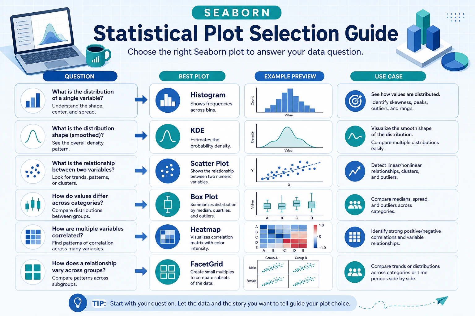
A Handy Plot Selection Guide for Beginners
Section titled “A Handy Plot Selection Guide for Beginners”| What you want to know most | Safer first choice |
|---|---|
| What does the distribution of this column look like? | histplot |
| Is there a relationship between two variables? | scatterplot |
| Do the distributions of two or more groups differ a lot? | boxplot / violinplot |
| Which category has more samples? | countplot |
| Are multiple numerical variables correlated? | heatmap |
This table can save beginners a lot of detours because you do not have to be overwhelmed by function names at the start.
boxplot: Box Plot
Section titled “boxplot: Box Plot”fig, axes = plt.subplots(1, 2, figsize=(14, 5))
# Basic box plotsns.boxplot(data=tips, x="day", y="total_bill", ax=axes[0])axes[0].set_title("Total Bill Distribution by Day")
# Use color to distinguish subgroupssns.boxplot(data=tips, x="day", y="total_bill", hue="sex", ax=axes[1])axes[1].set_title("Total Bill Distribution by Day (by Sex)")
plt.tight_layout()plt.show()violinplot: Violin Plot
Section titled “violinplot: Violin Plot”fig, ax = plt.subplots(figsize=(10, 5))
sns.violinplot(data=tips, x="day", y="total_bill", hue="sex", split=True, inner="quart", ax=ax)ax.set_title("Total Bill Distribution by Day (Violin Plot, female left, male right)")
plt.show()A violin plot = box plot + density distribution, so it shows more of the distribution shape than a box plot.
barplot: Mean Bar Plot (with Error Bars)
Section titled “barplot: Mean Bar Plot (with Error Bars)”fig, ax = plt.subplots(figsize=(8, 5))
sns.barplot(data=tips, x="day", y="total_bill", hue="sex", ci=95, ax=ax) # ci=95 means a 95% confidence intervalax.set_title("Average Total Bill by Day (error bars = 95% confidence interval)")
plt.show()countplot: Count Plot
Section titled “countplot: Count Plot”fig, axes = plt.subplots(1, 2, figsize=(12, 4))
# Simple countssns.countplot(data=tips, x="day", order=["Thur", "Fri", "Sat", "Sun"], ax=axes[0])axes[0].set_title("Number of Diners by Day")
# Grouped countssns.countplot(data=titanic, x="class", hue="survived", ax=axes[1])axes[1].set_title("Survival by Class")
plt.tight_layout()plt.show()Heatmap
Section titled “Heatmap”A heatmap uses color intensity to represent values and is most commonly used for correlation matrices.
Draw a Correlation Matrix
Section titled “Draw a Correlation Matrix”# Compute correlations for numeric columns# Select the numeric columns in tipsnumeric_cols = tips.select_dtypes(include="number")corr = numeric_cols.corr()
fig, ax = plt.subplots(figsize=(8, 6))sns.heatmap(corr, annot=True, fmt=".2f", cmap="RdBu_r", center=0, vmin=-1, vmax=1, square=True, linewidths=0.5, ax=ax)ax.set_title("Correlation Matrix of the Tips Dataset")plt.tight_layout()plt.show()Key parameters:
| Parameter | Purpose | Common value |
|---|---|---|
annot | Show values | True |
fmt | Number format | ".2f" for two decimals |
cmap | Color map | "RdBu_r" inverted red-blue |
center | Center value for colors | 0 (correlation coefficient) |
square | Square cells | True |
Custom Heatmap
Section titled “Custom Heatmap”# Pivot-table heatmap (for example, average total bill by day and time)pivot = tips.pivot_table(values="total_bill", index="day", columns="time", aggfunc="mean")
fig, ax = plt.subplots(figsize=(6, 4))sns.heatmap(pivot, annot=True, fmt=".1f", cmap="YlOrRd", linewidths=1, ax=ax)ax.set_title("Average Total Bill by Day and Time")plt.show()FacetGrid: Faceting Plots
Section titled “FacetGrid: Faceting Plots”Use FacetGrid when you want to split a chart into multiple subplots based on a variable.
# Facet by meal time to show the relationship between total bill and tipg = sns.FacetGrid(tips, col="time", row="sex", hue="smoker", height=4, aspect=1.2)g.map_dataframe(sns.scatterplot, x="total_bill", y="tip")g.add_legend()g.fig.suptitle("Total Bill vs Tip Faceted by Time and Sex", y=1.02)plt.show()More Faceting Examples
Section titled “More Faceting Examples”# Histogram faceted by dayg = sns.FacetGrid(tips, col="day", col_wrap=2, height=3)g.map_dataframe(sns.histplot, x="total_bill", kde=True)g.set_titles("Day: {col_name}")g.fig.suptitle("Total Bill Distribution by Day", y=1.02)plt.show()| Parameter | Purpose |
|---|---|
col | Split into columns by this variable |
row | Split into rows by this variable |
hue | Use this variable for color |
col_wrap | Maximum number of columns per row (wrap automatically) |
height | Height of each subplot |
aspect | Width-to-height ratio |
Why is faceting especially good for exploration?
Section titled “Why is faceting especially good for exploration?”Because it helps you turn:
- “The overall picture looks fine”
into:
- What is actually different across categories and groups?
This is very important for beginners, because many data issues do not show up in the overall distribution. Instead, they become obvious once you split the data into groups.
Seaborn Plot Type Cheat Sheet
Section titled “Seaborn Plot Type Cheat Sheet” root(("Seaborn<br/>Plot Types")) Distribution plots histplot Histogram kdeplot Density curve rugplot Rug plot Relational plots scatterplot Scatter plot lineplot Line plot pairplot Matrix of variables Categorical plots boxplot Box plot violinplot Violin plot barplot Mean bar plot countplot Count plot Matrix plots heatmap Heatmap Multi-panel FacetGrid Faceting pairplot PairwiseEvidence to Keep
Section titled “Evidence to Keep”Keep this page’s proof of learning as a small evidence card:
- Question
- what comparison, distribution, trend, or relationship the chart answers
- Chart Choice
- line, bar, scatter, histogram, box, heatmap, or interactive dashboard
- Artifact
- saved chart image/html plus the data slice used
- Failure Check
- misleading scale, overloaded chart, wrong aggregation, or missing labels
- Expected Output
- chart artifact with one sentence explaining the insight
Summary
Section titled “Summary”| Need | Function | Description |
|---|---|---|
| Check distribution | histplot / kdeplot | Histogram / density curve |
| Relationship between two variables | scatterplot / lineplot | Scatter plot / line plot |
| Relationships among all variables | pairplot | One-line matrix plot |
| Compare categories | boxplot / violinplot / barplot | Distribution / mean |
| Count categories | countplot | Bar chart |
| Numerical matrix | heatmap | Heatmap |
| Faceted display | FacetGrid | Multiple subplots |
Core advantage: You can draw beautiful charts with statistical information in one line of code, and pass a DataFrame directly.
What You Should Take Away from This Section
Section titled “What You Should Take Away from This Section”- The most important value of
Seabornis not that it is more flashy, but that it is better for quick statistical exploration - For your first EDA, start with distribution, then relationships, then categorical comparisons — this is usually the safest path
- When choosing a plot, it is more important to ask “What statistical phenomenon do I want to see?” than to memorize function names first
Hands-On Exercises
Section titled “Hands-On Exercises”Exercise 1: Explore Data Distribution
Section titled “Exercise 1: Explore Data Distribution”# Load the tips dataset# 1. Use histplot to draw the distribution of tip, colored by time# 2. Use kdeplot to draw the density curve of total_bill, grouped by sexExercise 2: Categorical Comparison
Section titled “Exercise 2: Categorical Comparison”# Load the titanic dataset# 1. Use boxplot to compare the age distribution across classes# 2. Use countplot to show the number of survivors in each classExercise 3: Correlation Analysis
Section titled “Exercise 3: Correlation Analysis”# Load the iris dataset# 1. Compute the correlation matrix for numeric columns# 2. Visualize it with heatmap and add value annotations# 3. Use pairplot to inspect relationships among all variablesExercise 4: Faceting Plots
Section titled “Exercise 4: Faceting Plots”# Use the tips dataset# Use FacetGrid to facet by day and draw a scatter plot of total_bill and tip# Use color to distinguish sexReference implementation and walkthrough
- For distribution charts, use
histplotorkdeplotand describe skew, outliers, and the approximate center. A beautiful curve without interpretation is incomplete. - For categorical comparisons, box plots and count plots answer different questions: spread versus frequency. Pick the one that matches the question before styling it.
- For heatmaps and pair plots, explain one or two relationships that matter and one limitation. Correlation or visual clustering is a lead for investigation, not proof by itself.