
3.6.2 Hands-on Project: Multi-Source Data Integration Analysis
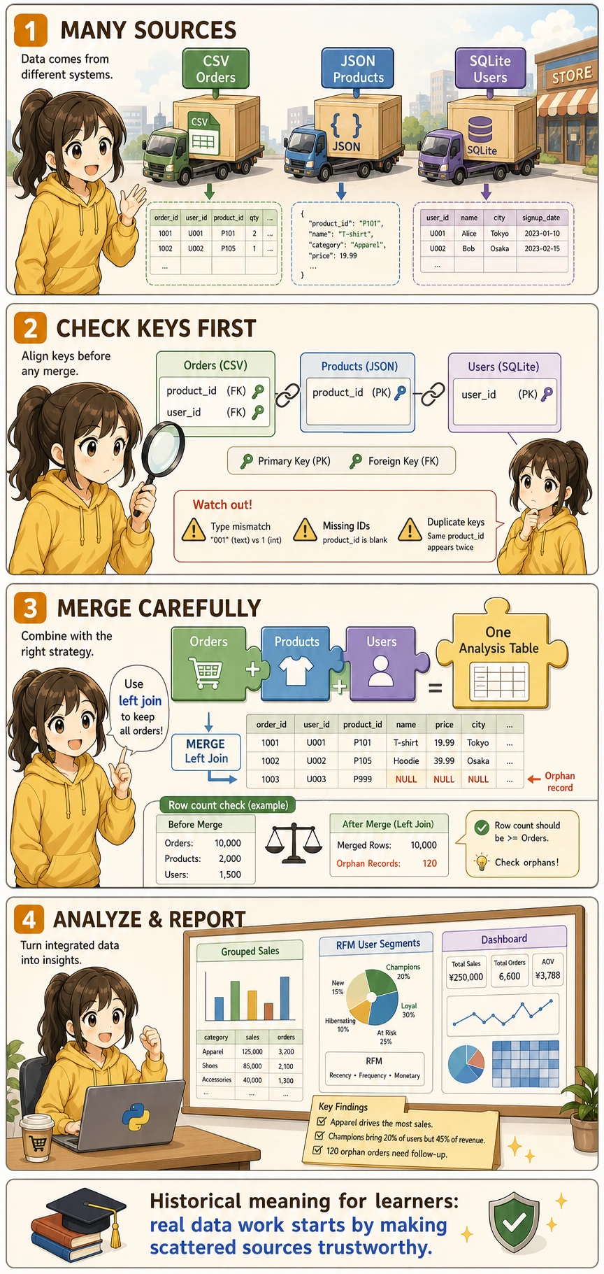
First, Build a Map
Section titled “First, Build a Map”For beginners, the most suitable way to understand this project is not “start merging first,” but to first clearly see:
flowchart LR A["Read in multi-source data"] --> B["Check primary keys and fields"] B --> C["Integrate into one wide table first"] C --> D["Then clean and derive features"] D --> E["Finally do analysis and dashboards"]So what this section really wants you to practice is:
- How multi-source data enters the same analysis table
- When to check keys first, and when to start analyzing
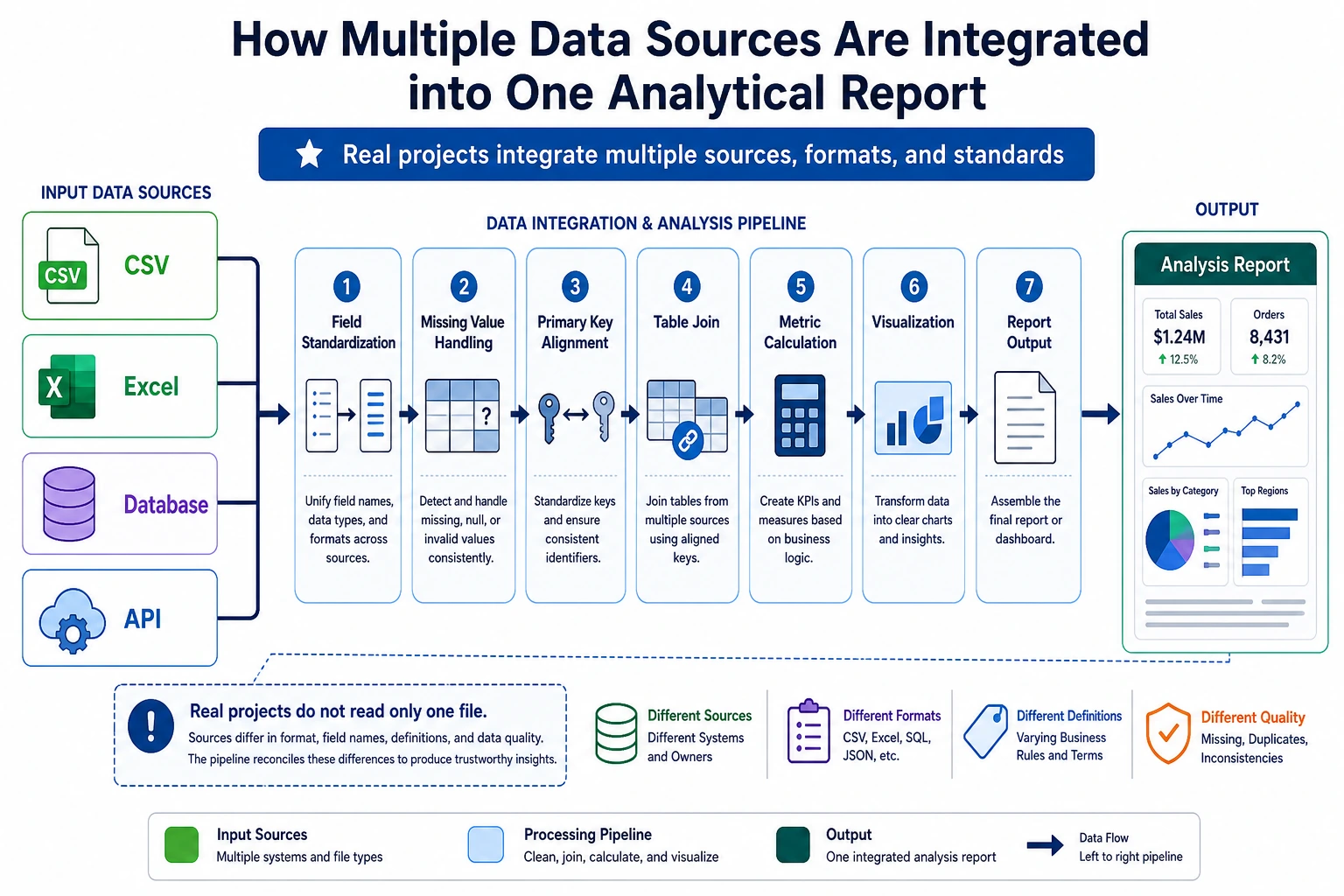
Project Overview
Section titled “Project Overview”In real work, data is almost never neatly placed in one CSV file. You need to fetch data from multiple sources such as CSV, JSON, and databases, then clean and integrate it before analysis.
flowchart TD    A["CSV file<br/>order data"] --> D["Data integration<br/>Pandas merge/concat"]    B["JSON file<br/>product data"] --> D    C["SQLite database<br/>user data"] --> D    D --> E["Data cleaning"]    E --> F["Analysis and visualization"]    F --> G["Output report/dashboard"]
    style A fill:#e3f2fd,stroke:#1565c0,color:#333    style B fill:#fff3e0,stroke:#e65100,color:#333    style C fill:#e8f5e9,stroke:#2e7d32,color:#333    style G fill:#f3e5f5,stroke:#7b1fa2,color:#333
A Better Beginner-Friendly Big Picture Analogy
Section titled “A Better Beginner-Friendly Big Picture Analogy”You can think of this project as:
- Combining tables from different departments into one master table that can actually be used for reporting
In other words, the real challenge in this project is not:
- Whether you can make charts
But rather:
- Whether the data can be aligned smoothly first
- Whether the tables can be connected correctly
Project Scenario
Section titled “Project Scenario”You are a data analyst for an online retail company. The company’s data is spread across different systems:
| Data source | Format | Content |
|---|---|---|
| Sales system export | CSV | Order records (order ID, user ID, product ID, quantity, date) |
| Product management system API | JSON | Product information (product ID, name, category, price) |
| User system database | SQLite | User information (user ID, name, city, registration date) |
Your task: integrate these data, analyze sales performance, and produce a valuable analysis report.
Acronyms and Terms to Understand First
Section titled “Acronyms and Terms to Understand First”| Term | Full name | Beginner-friendly meaning |
|---|---|---|
CSV | Comma-Separated Values | A plain-text table format, often exported from business systems |
JSON | JavaScript Object Notation | A structured text format commonly returned by APIs |
API | Application Programming Interface | A doorway for one system to provide data or capabilities to another system |
ID | Identifier | A stable value used to recognize one user, product, order, or record |
PK | Primary Key | The unique ID of a row in its own table |
FK | Foreign Key | An ID that points to a row in another table |
RFM | Recency, Frequency, Monetary | A classic user segmentation method based on recent purchase, purchase frequency, and total spending |
In this project, the most important engineering habit is to check ID / PK / FK before merging. Many analysis errors are not caused by charts or statistics, but by joining the wrong rows together.
Knowledge Areas Involved
Section titled “Knowledge Areas Involved”| Skill | Corresponding chapter |
|---|---|
| CSV/JSON read and write | Chapter 3, Section 3.2 |
| Pandas merge | Chapter 3, Section 3.7 |
| Grouping, aggregation, and pivot tables | Chapter 3, Section 3.6 |
| Time series processing | Chapter 3, Section 3.8 |
| Matplotlib/Seaborn visualization | Chapter 4 |
| SQLite database operations | Chapter 5 |
Prepare Mock Data
Section titled “Prepare Mock Data”In real projects, data is already available. But for learning, we’ll first generate mock data with Python.
Generate Order Data (CSV)
Section titled “Generate Order Data (CSV)”import numpy as npimport pandas as pdimport jsonimport sqlite3from datetime import datetime, timedelta
rng = np.random.default_rng(seed=42)
# ---------- Order data ----------n_orders = 2000order_dates = pd.date_range('2024-01-01', '2024-12-31', freq='h')order_dates = rng.choice(order_dates, n_orders)
orders = pd.DataFrame({ 'order_id': range(1, n_orders + 1), 'user_id': rng.integers(1, 201, n_orders), # 200 users 'product_id': rng.integers(1, 51, n_orders), # 50 products 'quantity': rng.choice([1, 1, 1, 2, 2, 3], n_orders), 'order_date': order_dates})
# Save as CSVorders.to_csv('orders.csv', index=False)print(f"Order data: {orders.shape}")orders.head()Generate Product Data (JSON)
Section titled “Generate Product Data (JSON)”# ---------- Product data ----------categories = ['Electronics', 'Clothing', 'Food', 'Home', 'Books']products = []
for i in range(1, 51): cat = rng.choice(categories) # Different categories have different price ranges price_ranges = { 'Electronics': (200, 5000), 'Clothing': (50, 800), 'Food': (10, 100), 'Home': (30, 500), 'Books': (20, 150), } low, high = price_ranges[cat] price = round(rng.uniform(low, high), 2)
products.append({ 'product_id': i, 'name': f'{cat}_{i:03d}', 'category': cat, 'price': price })
# Save as JSONwith open('products.json', 'w', encoding='utf-8') as f: json.dump(products, f, ensure_ascii=False, indent=2)
print(f"Product data: {len(products)} products")pd.DataFrame(products).head()Generate User Data (SQLite)
Section titled “Generate User Data (SQLite)”# ---------- User data ----------cities = ["Beijing", "Shanghai", "Guangzhou", "Shenzhen", "Hangzhou", "Chengdu", "Wuhan", "Nanjing", "Chongqing", "Xi'an"]
users = pd.DataFrame({ 'user_id': range(1, 201), 'name': [f'User_{i:03d}' for i in range(1, 201)], 'city': rng.choice(cities, 200), 'register_date': pd.date_range('2022-01-01', periods=200, freq='2D')})
# Save to SQLiteconn = sqlite3.connect('users.db')users.to_sql('users', conn, if_exists='replace', index=False)conn.close()
print(f"User data: {users.shape}")users.head()Read Multi-Source Data
Section titled “Read Multi-Source Data”Read CSV
Section titled “Read CSV”import pandas as pdimport numpy as npimport matplotlib.pyplot as pltimport seaborn as snsimport jsonimport sqlite3
plt.rcParams['font.sans-serif'] = ['Arial Unicode MS']plt.rcParams['axes.unicode_minus'] = Falsesns.set_theme(style="whitegrid", font_scale=1.1)
# 1. Read CSVorders = pd.read_csv('orders.csv', parse_dates=['order_date'])print(f"Order data: {orders.shape}")print(orders.dtypes)orders.head()Read JSON
Section titled “Read JSON”# 2. Read JSONwith open('products.json', 'r', encoding='utf-8') as f: products_list = json.load(f)
products = pd.DataFrame(products_list)print(f"\nProduct data: {products.shape}")products.head()You can also read it directly with Pandas:
# One line with Pandasproducts = pd.read_json('products.json')Read SQLite
Section titled “Read SQLite”# 3. Read SQLiteconn = sqlite3.connect('users.db')users = pd.read_sql_query("SELECT * FROM users", conn, parse_dates=['register_date'])conn.close()
print(f"\nUser data: {users.shape}")users.head()Data Overview
Section titled “Data Overview”print("=" * 50)print("Data Source Summary")print("=" * 50)print(f"Order table: {orders.shape[0]} rows × {orders.shape[1]} columns")print(f"Product table: {products.shape[0]} rows × {products.shape[1]} columns")print(f"User table: {users.shape[0]} rows × {users.shape[1]} columns")
# Check relationship keysprint(f"\nUser ID range in orders: {orders['user_id'].min()} ~ {orders['user_id'].max()}")print(f"Product ID range in orders: {orders['product_id'].min()} ~ {orders['product_id'].max()}")print(f"User ID range in user table: {users['user_id'].min()} ~ {users['user_id'].max()}")print(f"Product ID range in product table: {products['product_id'].min()} ~ {products['product_id'].max()}")What Should You Ask First in Multi-Source Analysis?
Section titled “What Should You Ask First in Multi-Source Analysis?”The most important questions to ask first are:
- Which key connects these tables?
- Are the key ranges and data types consistent?
- Will there be a large number of unmatched records after merging?
This step is especially important because many problems that look like “analysis issues” later on are actually caused by incorrect merging at the beginning.
Data Integration
Section titled “Data Integration”This is the core step of the project — merging three tables into one wide table.
Integration Strategy
Section titled “Integration Strategy”flowchart LR O["orders table"] -->|"product_id"| OP["orders + products"] P["products table"] --> OP OP -->|"user_id"| FULL["complete wide table"] U["users table"] --> FULL
style O fill:#e3f2fd,stroke:#1565c0,color:#333 style P fill:#fff3e0,stroke:#e65100,color:#333 style U fill:#e8f5e9,stroke:#2e7d32,color:#333 style FULL fill:#f3e5f5,stroke:#7b1fa2,color:#333Merge Operations
Section titled “Merge Operations”# Step 1: orders + product informationdf = orders.merge(products, on='product_id', how='left')print(f"After merging products: {df.shape}")
# Step 2: + user informationdf = df.merge(users, on='user_id', how='left')print(f"After merging users: {df.shape}")
df.head()Compute Key Metrics
Section titled “Compute Key Metrics”# Order amount = unit price × quantitydf['amount'] = df['price'] * df['quantity']
# Extract time dimensionsdf['month'] = df['order_date'].dt.monthdf['weekday'] = df['order_date'].dt.day_name()df['quarter'] = df['order_date'].dt.quarter
# View resultsprint(f"\nComplete dataset: {df.shape[0]} rows × {df.shape[1]} columns")print(f"Total sales: ¥{df['amount'].sum():,.0f}")print(f"Average order amount: ¥{df['amount'].mean():,.0f}")df[['order_id', 'name_x', 'category', 'quantity', 'price', 'amount', 'city', 'month']].head(10)Data Quality Check
Section titled “Data Quality Check”# Check data completeness after mergingprint("=== Data Quality Check After Merging ===")print(f"Total rows: {len(df)}")print(f"Missing values:")print(df.isnull().sum()[df.isnull().sum() > 0])
# If there are missing values, some IDs do not exist in the related tables# Check orphan recordsorphan_products = set(orders['product_id']) - set(products['product_id'])orphan_users = set(orders['user_id']) - set(users['user_id'])print(f"\nUnmatched product IDs: {orphan_products if orphan_products else 'None'}")print(f"Unmatched user IDs: {orphan_users if orphan_users else 'None'}")A Data Integration Checklist Beginners Can Copy Directly
Section titled “A Data Integration Checklist Beginners Can Copy Directly”When doing multi-source integration for the first time, the safest checklist is usually:
- Is the primary key unique, and is the data type consistent?
- Did the row count change abnormally after merging?
- Are there a lot of orphan records that could not be matched?
- Are there any column name conflicts or ambiguities after merging?
Check these 4 items first, and then move on to analysis. Things will usually be much more stable.
Analysis 1: Sales Overview
Section titled “Analysis 1: Sales Overview”Overall Metrics
Section titled “Overall Metrics”print("=" * 50)print(" 2024 Sales Overview")print("=" * 50)print(f" Total orders: {df['order_id'].nunique():,}")print(f" Total sales: ¥{df['amount'].sum():,.0f}")print(f" Average order value: ¥{df.groupby('order_id')['amount'].sum().mean():,.0f}")print(f" Active users: {df['user_id'].nunique()}")print(f" Number of products: {df['product_id'].nunique()}")Category Analysis
Section titled “Category Analysis”# Sales and order volume by categorycat_stats = df.groupby('category').agg( Sales=('amount', 'sum'), Order_Count=('order_id', 'count'), Average_Price=('price', 'mean'), Product_Count=('product_id', 'nunique')).round(0).sort_values('Sales', ascending=False)
print(cat_stats)fig, axes = plt.subplots(1, 2, figsize=(14, 5))
# Category sales sharecolors = ['#2196f3', '#ff9800', '#4caf50', '#f44336', '#9c27b0']axes[0].pie(cat_stats['Sales'], labels=cat_stats.index, autopct='%1.1f%%', colors=colors, startangle=90, pctdistance=0.85)axes[0].set_title('Sales Share by Category')
# Compare order volume by categorycat_stats['Order_Count'].plot(kind='barh', ax=axes[1], color=colors)axes[1].set_title('Order Volume by Category')axes[1].set_xlabel('Number of Orders')
plt.tight_layout()plt.savefig('07_category.png', dpi=150, bbox_inches='tight')plt.show()City Analysis
Section titled “City Analysis”# Top cities by salescity_stats = df.groupby('city').agg( Sales=('amount', 'sum'), Order_Count=('order_id', 'count'), User_Count=('user_id', 'nunique')).sort_values('Sales', ascending=False)
fig, ax = plt.subplots(figsize=(10, 5))city_stats['Sales'].plot(kind='bar', color='steelblue', ax=ax)ax.set_title('Sales by City')ax.set_ylabel('Sales (CNY)')ax.set_xticklabels(ax.get_xticklabels(), rotation=45, ha='right')
# Add labels on barsfor i, v in enumerate(city_stats['Sales']): ax.text(i, v + v*0.01, f'¥{v:,.0f}', ha='center', va='bottom', fontsize=9)
plt.tight_layout()plt.savefig('08_city.png', dpi=150, bbox_inches='tight')plt.show()What Is the Most Important Thing to Learn Here?
Section titled “What Is the Most Important Thing to Learn Here?”The most important thing to learn is:
- Once multi-source integration is successful, the later analysis becomes more and more like single-table analysis
In other words, the real bottleneck in this project is often not the chart, but:
- Understanding the data before merging
- Aligning keys during merging
Analysis 2: Time Trends
Section titled “Analysis 2: Time Trends”Monthly Trend
Section titled “Monthly Trend”# Aggregate by monthmonthly = df.groupby('month').agg( Sales=('amount', 'sum'), Order_Count=('order_id', 'count')).reset_index()
fig, ax1 = plt.subplots(figsize=(12, 5))
# Dual Y-axis: sales as bars, order volume as a linecolor1 = 'steelblue'color2 = 'coral'
bars = ax1.bar(monthly['month'], monthly['Sales'], color=color1, alpha=0.7, label='Sales')ax1.set_xlabel('Month')ax1.set_ylabel('Sales (CNY)', color=color1)ax1.tick_params(axis='y', labelcolor=color1)ax1.set_xticks(range(1, 13))
ax2 = ax1.twinx()ax2.plot(monthly['month'], monthly['Order_Count'], color=color2, marker='o', linewidth=2, label='Order Volume')ax2.set_ylabel('Order Volume', color=color2)ax2.tick_params(axis='y', labelcolor=color2)
ax1.set_title('Monthly Sales Trend (2024)')
# Merge legendlines1, labels1 = ax1.get_legend_handles_labels()lines2, labels2 = ax2.get_legend_handles_labels()ax1.legend(lines1 + lines2, labels1 + labels2, loc='upper left')
plt.tight_layout()plt.savefig('09_monthly.png', dpi=150, bbox_inches='tight')plt.show()Weekly Distribution
Section titled “Weekly Distribution”# Statistics by day of weekweekday_order = ['Monday', 'Tuesday', 'Wednesday', 'Thursday', 'Friday', 'Saturday', 'Sunday']weekday_cn = ['Mon', 'Tue', 'Wed', 'Thu', 'Fri', 'Sat', 'Sun']
weekday_stats = df.groupby('weekday')['amount'].agg(['sum', 'count']).reindex(weekday_order)weekday_stats.index = weekday_cn
fig, axes = plt.subplots(1, 2, figsize=(14, 5))
weekday_stats['sum'].plot(kind='bar', color='mediumseagreen', ax=axes[0])axes[0].set_title('Sales by Day of Week')axes[0].set_ylabel('Sales (CNY)')axes[0].set_xticklabels(weekday_cn, rotation=0)
weekday_stats['count'].plot(kind='bar', color='salmon', ax=axes[1])axes[1].set_title('Order Volume by Day of Week')axes[1].set_ylabel('Number of Orders')axes[1].set_xticklabels(weekday_cn, rotation=0)
plt.tight_layout()plt.savefig('10_weekday.png', dpi=150, bbox_inches='tight')plt.show()Monthly Trend by Category
Section titled “Monthly Trend by Category”# Monthly sales by categorycat_monthly = df.groupby(['month', 'category'])['amount'].sum().reset_index()
plt.figure(figsize=(12, 6))sns.lineplot(data=cat_monthly, x='month', y='amount', hue='category', marker='o', linewidth=2)plt.title('Monthly Sales Trend by Category')plt.xlabel('Month')plt.ylabel('Sales (CNY)')plt.xticks(range(1, 13))plt.legend(title='Category', bbox_to_anchor=(1.02, 1), loc='upper left')plt.tight_layout()plt.savefig('11_cat_monthly.png', dpi=150, bbox_inches='tight')plt.show()Analysis 3: User Analysis
Section titled “Analysis 3: User Analysis”User Consumption Segmentation
Section titled “User Consumption Segmentation”Use a simplified version of the RFM model to segment users:
flowchart LR    A["RFM model"] --> R["R — Recency<br/>Most recent purchase"]    A --> F["F — Frequency<br/>Purchase frequency"]    A --> M["M — Monetary<br/>Total spending"]
    style A fill:#e3f2fd,stroke:#1565c0,color:#333    style R fill:#fff3e0,stroke:#e65100,color:#333    style F fill:#fff3e0,stroke:#e65100,color:#333    style M fill:#fff3e0,stroke:#e65100,color:#333
# Compute RFMtoday = pd.Timestamp('2025-01-01') # reference date
rfm = df.groupby('user_id').agg( Recency=('order_date', lambda x: (today - x.max()).days), # days since last order Frequency=('order_id', 'nunique'), # number of orders Monetary=('amount', 'sum') # total spending).round(0)
print(rfm.describe().round(1))rfm.head(10)Visualize User Segments
Section titled “Visualize User Segments”fig, axes = plt.subplots(1, 3, figsize=(16, 4))
axes[0].hist(rfm['Recency'], bins=30, color='steelblue', edgecolor='white')axes[0].set_title('R: Days Since Most Recent Purchase')axes[0].set_xlabel('Days')
axes[1].hist(rfm['Frequency'], bins=20, color='coral', edgecolor='white')axes[1].set_title('F: Purchase Frequency')axes[1].set_xlabel('Number of Orders')
axes[2].hist(rfm['Monetary'], bins=30, color='mediumseagreen', edgecolor='white')axes[2].set_title('M: Total Spending')axes[2].set_xlabel('Amount (CNY)')
plt.tight_layout()plt.savefig('12_rfm.png', dpi=150, bbox_inches='tight')plt.show()Simple User Segmentation
Section titled “Simple User Segmentation”# Divide users into 4 groups based on spending and frequencyrfm['value_group'] = pd.qcut(rfm['Monetary'], q=4, labels=['Low Value', 'Lower-Mid', 'Upper-Mid', 'High Value'])rfm['freq_group'] = pd.qcut(rfm['Frequency'], q=3, labels=['Low Freq', 'Mid Freq', 'High Freq'], duplicates='drop')
# Crosstab: value × frequencycross = pd.crosstab(rfm['value_group'], rfm['freq_group'], margins=True)print("User segmentation crosstab:")print(cross)# Characteristics of high-value usershigh_value = rfm[rfm['value_group'] == 'High Value']print(f"\nHigh-value users: {len(high_value)}")print(f" Average spending: ¥{high_value['Monetary'].mean():,.0f}")print(f" Average frequency: {high_value['Frequency'].mean():.1f} orders")print(f" Average recency: {high_value['Recency'].mean():.0f} days")City × User Segmentation
Section titled “City × User Segmentation”# Merge RFM segmentation back to the main tableuser_city = df.groupby('user_id')['city'].first().reset_index()rfm_city = rfm.reset_index().merge(user_city, on='user_id')
# Share of high-value users in each citycity_value = pd.crosstab(rfm_city['city'], rfm_city['value_group'], normalize='index') * 100
plt.figure(figsize=(12, 6))city_value[['High Value', 'Upper-Mid']].plot(kind='barh', stacked=True, color=['#2196f3', '#90caf9'], figsize=(10, 6))plt.title('Share of Upper-Mid and High-Value Users by City')plt.xlabel('Share (%)')plt.legend(title='User Segment')plt.tight_layout()plt.savefig('13_city_value.png', dpi=150, bbox_inches='tight')plt.show()Analysis 4: Comprehensive Dashboard
Section titled “Analysis 4: Comprehensive Dashboard”Integrate key metrics and charts into one large figure:
fig = plt.figure(figsize=(18, 14))fig.suptitle('2024 Online Retail Analysis Dashboard', fontsize=18, fontweight='bold', y=0.98)
# ---------- 1. Core metrics (text) ----------ax_text = fig.add_subplot(4, 3, (1, 3))ax_text.axis('off')
metrics = [    (f"¥{df['amount'].sum():,.0f}", "Total Sales"),    (f"{df['order_id'].nunique():,}", "Total Orders"),    (f"{df['user_id'].nunique()}", "Active Users"),    (f"¥{df.groupby('order_id')['amount'].sum().mean():,.0f}", "Average Order Value"),]
for i, (value, label) in enumerate(metrics):    x_pos = 0.12 + i * 0.22    ax_text.text(x_pos, 0.6, value, fontsize=22, fontweight='bold',                 color='#1565c0', ha='center', transform=ax_text.transAxes)    ax_text.text(x_pos, 0.2, label, fontsize=12, color='#666',                 ha='center', transform=ax_text.transAxes)
# ---------- 2. Monthly trend ----------ax2 = fig.add_subplot(4, 3, (4, 6))monthly_amount = df.groupby('month')['amount'].sum()ax2.fill_between(monthly_amount.index, monthly_amount.values, alpha=0.3, color='steelblue')ax2.plot(monthly_amount.index, monthly_amount.values, color='steelblue', linewidth=2, marker='o')ax2.set_title('Monthly Sales Trend', fontsize=13)ax2.set_xlabel('Month')ax2.set_ylabel('Sales')ax2.set_xticks(range(1, 13))
# ---------- 3. Category pie chart ----------ax3 = fig.add_subplot(4, 3, 7)cat_amount = df.groupby('category')['amount'].sum().sort_values(ascending=False)colors = ['#2196f3', '#ff9800', '#4caf50', '#f44336', '#9c27b0']ax3.pie(cat_amount, labels=cat_amount.index, autopct='%1.0f%%',        colors=colors, startangle=90, textprops={'fontsize': 9})ax3.set_title('Category Sales Share', fontsize=13)
# ---------- 4. Top products ----------ax4 = fig.add_subplot(4, 3, 8)# Use the name column associated with product_id (may be called name or product_name)product_col = 'name' if 'name' in df.columns else df.columns[df.columns.str.contains('name')][0]top_products = df.groupby('product_id')['amount'].sum().nlargest(8)product_names = products.set_index('product_id').loc[top_products.index, 'name']ax4.barh(product_names.values[::-1], top_products.values[::-1], color='coral')ax4.set_title('Top 8 Best-Selling Products', fontsize=13)ax4.set_xlabel('Sales')
# ---------- 5. City comparison ----------ax5 = fig.add_subplot(4, 3, 9)city_amount = df.groupby('city')['amount'].sum().sort_values(ascending=True)ax5.barh(city_amount.index, city_amount.values, color='mediumseagreen')ax5.set_title('City Sales Ranking', fontsize=13)ax5.set_xlabel('Sales')
# ---------- 6. User spending distribution ----------ax6 = fig.add_subplot(4, 3, (10, 12))user_amount = df.groupby('user_id')['amount'].sum()ax6.hist(user_amount, bins=40, color='#7986cb', edgecolor='white', alpha=0.8)ax6.axvline(user_amount.mean(), color='red', linestyle='--', linewidth=2, label=f'Mean: ¥{user_amount.mean():,.0f}')ax6.axvline(user_amount.median(), color='orange', linestyle='--', linewidth=2, label=f'Median: ¥{user_amount.median():,.0f}')ax6.set_title('User Spending Distribution', fontsize=13)ax6.set_xlabel('Total Spending (CNY)')ax6.set_ylabel('Number of Users')ax6.legend()
plt.tight_layout(rect=[0, 0, 1, 0.96])plt.savefig('14_dashboard.png', dpi=150, bbox_inches='tight')plt.show()
Findings and Recommendations
Section titled “Findings and Recommendations”Key Findings
Section titled “Key Findings” root((Analysis Conclusions)) Sales Performance Total sales and order volume distribution Clear differences across categories Electronics contribute the most Time Patterns Monthly fluctuations Weekday vs weekend differences Seasonality User Insights A small number of users contribute most revenue Significant differences between cities Long-tail distribution of user spending Business Recommendations Focus on high-value users Expand into potential cities Category-specific promotionsRecommendations for the Company
Section titled “Recommendations for the Company”- Retain high-value users: The top 20% of users contribute most of the sales. A VIP mechanism should be created with exclusive services.
- Category strategy: Although electronics have high unit prices, food and books can be used to attract traffic and improve user stickiness.
- City expansion: Analyze the penetration rate of each city. For cities with fewer users but higher per-capita spending, it is worth increasing promotion efforts.
- Time-based operations: Arrange promotions and inventory reasonably according to monthly and weekly trends.
- User growth: Focus on conversion between new and existing users, and issue coupons to low-frequency users to reactivate them.
Project Summary and Extension
Section titled “Project Summary and Extension”Knowledge Review
Section titled “Knowledge Review”| Step | Skills Used | Corresponding Code |
|---|---|---|
| Data reading | read_csv, read_json, read_sql_query | Section 2 |
| Data merging | merge (multi-table relationship) | Section 3 |
| Group aggregation | groupby, agg, pivot_table | Sections 4–6 |
| Time processing | dt.month, dt.day_name(), date_range | Section 5 |
| Visualization | Matplotlib subplots, dual Y-axis, Seaborn | Throughout |
Advanced Challenges
Section titled “Advanced Challenges”Challenge 1: Add More Data Sources
Fetch data from a web API, such as service status or campaign traffic, and analyze the impact on conversion:
# Example: simulate service status datarng = np.random.default_rng(seed=42)service_status = pd.DataFrame({ 'date': pd.date_range('2024-01-01', '2024-12-31'), 'latency_ms': rng.normal(180, 35, 366).clip(40, None), 'incident': rng.choice([0, 0, 0, 1], 366) # 0=normal, 1=incident})Challenge 2: Use Plotly to Build an Interactive Dashboard
import plotly.express as pxfrom plotly.subplots import make_subplots
# Interactive monthly trendfig = px.line(monthly, x='month', y='sales',              title='Monthly Sales Trend', markers=True)fig.show()
Challenge 3: Automatically Generate a PDF Report
Explore the matplotlib PdfPages or reportlab library to automatically generate a PDF analysis report.
Challenge 4: Use a Real Dataset
Find a real e-commerce dataset on Kaggle (for example, Brazilian E-Commerce) and recreate this project.
Project Checklist
Section titled “Project Checklist”| Checklist Item | Completed |
|---|---|
| Read order data from CSV | ☐ |
| Read product data from JSON | ☐ |
| Read user data from SQLite | ☐ |
| Merge the three tables with merge | ☐ |
| Check the merged data quality | ☐ |
| Complete sales overview analysis (category, city) | ☐ |
| Complete time trend analysis (monthly, weekly) | ☐ |
| Complete user analysis (RFM, segmentation) | ☐ |
| Create a comprehensive dashboard (large figure) | ☐ |
| Write at least 3 analysis conclusions | ☐ |
| Provide business recommendations | ☐ |
Project reference and review notes
- A complete project proves that every source was loaded, merge keys were checked, row counts were compared before and after each join, and unmatched records were inspected.
- The final analysis should contain at least three insights with business or product meaning, not just three charts. Each insight needs the table or chart that supports it.
- Good recommendations name the evidence, the action, and the risk or assumption. For example, do not just say “improve sales”; say which segment, why, and what to monitor.
Suggested Version Roadmap
Section titled “Suggested Version Roadmap”| Version | Goal | Delivery Focus |
|---|---|---|
| Basic version | Get the minimal loop working | Can input, process, and output, while keeping one set of examples |
| Standard version | Build a presentable project | Add configuration, logging, error handling, README, and screenshots |
| Challenge version | Approach portfolio quality | Add evaluation, comparison experiments, failed-sample analysis, and next-step roadmap |
It is recommended to finish the basic version first. Don’t try to make everything big and complete at the beginning. With every version upgrade, write “what new capability was added, how it was verified, and what problems remain” into the README.
Evidence to Keep
Section titled “Evidence to Keep”Keep this page’s proof of learning as a small evidence card:
- Analysis Goal
- business/data question and success criterion
- Data Evidence
- source, cleaning notes, features, and chart/table outputs
- Result
- insight, metric, dashboard, or report section
- Failure Check
- dirty data, biased sample, wrong aggregation, or unreproducible notebook
- Expected Output
- reproducible analysis folder with data, charts, and a short report