
9.10.3 Project: Data Analysis Agent
Learning objectives
Section titled “Learning objectives”- Learn how to define the minimum project scope for a Data Analysis Agent
- Learn how to connect data input, statistical computation, and explanatory output into a closed loop
- Learn how to use a minimal example to demonstrate “reproducibility”
- Learn how to package this topic into a strong one-page portfolio project
First, build a map
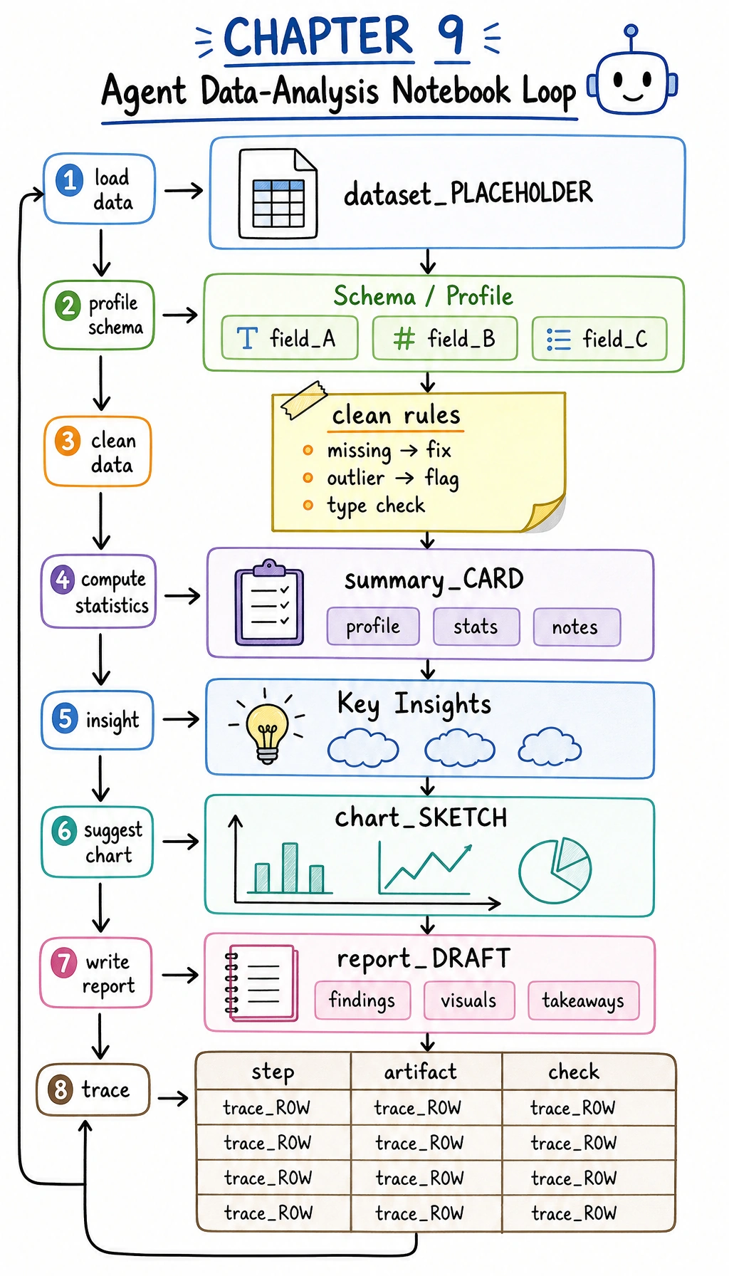
Section titled “First, build a map”A Data Analysis Agent is easier to understand as “read data -> compute statistics -> form interpretation -> provide visualization suggestions”:
flowchart LR A["Input table"] --> B["Statistical computation"] B --> C["Generate insights"] C --> D["Chart suggestions / report suggestions"]So what this section really wants to solve is:
- Why a Data Analysis Agent is not just “good at calling pandas”
- Why a reproducible intermediate process is more important than a final one-line conclusion
How should we narrow the project topic?
Section titled “How should we narrow the project topic?”It is recommended to start with:
- reading a small table
- calculating a few core statistics
- generating an insight summary based on those statistics
Rather than starting with:
- an automatic BI platform
- a fully automated report factory
A more beginner-friendly overall analogy
Section titled “A more beginner-friendly overall analogy”You can think of a Data Analysis Agent as:
- an analysis assistant that first computes, then explains, and can also suggest how to visualize the data
Its difference from a regular calculator is not:
- calculating faster
But rather:
- organizing numbers into conclusions with explanatory power
First run a minimal data analysis loop
Section titled “First run a minimal data analysis loop”This example will:
- Read a small sales table
- Compute total sales and category averages
- Give a simple analytical conclusion
sales = [    {"category": "course", "amount": 299},    {"category": "course", "amount": 199},    {"category": "book", "amount": 59},    {"category": "book", "amount": 79},    {"category": "service", "amount": 499},]

def summarize_sales(rows):    total = sum(row["amount"] for row in rows)
    grouped = {}    for row in rows:        grouped.setdefault(row["category"], []).append(row["amount"])
    per_category_avg = {        category: round(sum(values) / len(values), 2)        for category, values in grouped.items()    }
    top_category = max(per_category_avg, key=per_category_avg.get)
    return {        "total_amount": total,        "per_category_avg": per_category_avg,        "insight": f"{top_category} has the highest average order value.",    }

result = summarize_sales(sales)print(result)
Expected output:
{'total_amount': 1135, 'per_category_avg': {'course': 249.0, 'book': 69.0, 'service': 499.0}, 'insight': 'service has the highest average order value.'}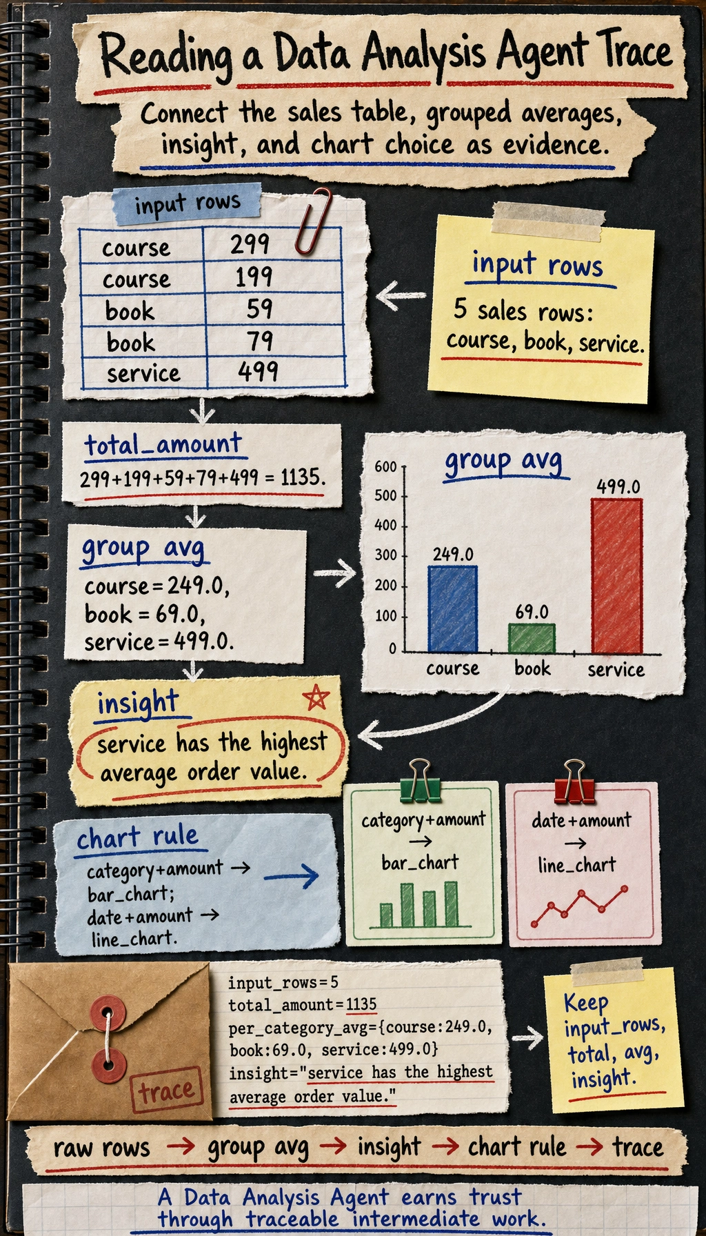
Why is this already very project-like?
Section titled “Why is this already very project-like?”Because it does not only do “computation”, it also does:
- input data
- intermediate statistics
- output conclusions
This is already the smallest data analysis workflow.
Why is insight especially important?
Section titled “Why is insight especially important?”Because users are usually not trying to look at raw numbers, but want:
- conclusions with explanatory power
This is exactly the difference between a Data Analysis Agent and a regular calculator.
A beginner-friendly project checklist to remember first
Section titled “A beginner-friendly project checklist to remember first”| Step | What should you confirm first |
|---|---|
| Input data | Are the field meanings clear |
| Intermediate statistics | Are the calculation rules consistent |
| insight | Do the conclusion and the numbers match |
| Chart suggestions | Does the chart type fit the data shape |
This table is especially useful for beginners because it compresses “Data Analysis Agent” back into a workflow that can be checked step by step.
What should a portfolio-level Data Analysis Agent show?
Section titled “What should a portfolio-level Data Analysis Agent show?”What does the input data look like?
Section titled “What does the input data look like?”It is best to make clear:
- fields
- sample size
- missing value status
Intermediate computation results
Section titled “Intermediate computation results”For example:
- summary statistics
- grouped results
- trend judgments
Final explanation
Section titled “Final explanation”For example:
- which product category performed best
- which time period fluctuated the most
Chart suggestions
Section titled “Chart suggestions”Even if you do not generate charts directly, you can still output:
- whether a bar chart or a line chart should be used
This makes the project feel closer to a real analysis assistant.
Add a minimal “chart recommender”
Section titled “Add a minimal “chart recommender””def suggest_chart(columns): if "date" in columns and "amount" in columns: return "line_chart" if "category" in columns and "amount" in columns: return "bar_chart" return "table"
print(suggest_chart(["category", "amount"]))print(suggest_chart(["date", "amount"]))Expected output:
bar_chartline_chartWhat value does this small module provide?
Section titled “What value does this small module provide?”It shows that the project is not just “doing arithmetic”, but is gradually moving toward:
- analysis
- explanation
- visualization suggestions
Let’s look at a minimal “analysis trace” example
Section titled “Let’s look at a minimal “analysis trace” example”Continue in the same file or Python session, because this block reuses sales and result.
trace = {    "input_rows": len(sales),    "total_amount": result["total_amount"],    "per_category_avg": result["per_category_avg"],    "insight": result["insight"],}
print(trace)
Expected output:
{'input_rows': 5, 'total_amount': 1135, 'per_category_avg': {'course': 249.0, 'book': 69.0, 'service': 499.0}, 'insight': 'service has the highest average order value.'}This example is especially suitable for beginners because it helps you see:
- where the real value of a Data Analysis Agent project lies
- often in whether the process can be verified
Evidence to Keep
Section titled “Evidence to Keep”Keep this page’s proof of learning as a small evidence card:
- Project Goal
- what the agent should accomplish and what it must not do
- Baseline
- single-agent loop before adding advanced features
- Trace Pack
- goal, plan, tool calls, observations, memory, evaluation
- Failure Log
- one failed or unsafe run with root cause
- Deliverable
- README, run command, trace screenshot/log, next step
The most common pitfalls
Section titled “The most common pitfalls”Misunderstanding the fields
Section titled “Misunderstanding the fields”This is a typical fatal problem for Data Analysis Agents. If the field meanings are misunderstood, the entire workflow may be led astray.
Only showing the conclusion, not the intermediate process
Section titled “Only showing the conclusion, not the intermediate process”This makes the project feel like a black box and makes it hard to build trust.
Only handling the happy path
Section titled “Only handling the happy path”If you do not show:
- missing values
- outliers
- inconsistent calculation rules
the project will feel unrealistic.
How do you polish it into a portfolio-level page?
Section titled “How do you polish it into a portfolio-level page?”Suggested structure
Section titled “Suggested structure”- Raw data example
- Intermediate statistics table
- Insight summary
- Chart suggestions
- Error cases
One highlight worth adding
Section titled “One highlight worth adding”Show:
- raw data
- intermediate computations
- final conclusions
as a single trace. This will be much stronger than pasting only a result.
A beginner-friendly evaluation table to remember first
Section titled “A beginner-friendly evaluation table to remember first”| Dimension | First question |
|---|---|
| Correctness | Are the numbers calculated correctly |
| Reproducibility | Can the intermediate process be traced back |
| Interpretability | Do the conclusions match the statistics |
| Presentation | Do the chart suggestions naturally fit the conclusions |
This table is especially useful for beginners because it breaks “Is the Agent project good?” into a few more concrete judgments.
Summary
Section titled “Summary”The most important thing in this section is to build a portfolio-level judgment:
The real highlight of a Data Analysis Agent is not whether it can call pandas, but whether it can organize input data, intermediate computations, and final insights into a reproducible analysis loop.
As long as that loop is clear, this project is very well suited to showing your understanding of multi-tool Agents.
If you turn this into a portfolio project, what is most worth showing?
Section titled “If you turn this into a portfolio project, what is most worth showing?”What is usually most worth showing is not:
- a single analytical conclusion
But rather:
- A raw data example
- Intermediate statistical results
- How the insight was generated
- Why the chart suggestion was made that way
This makes it easier for others to see:
- that you understand the analysis loop
- not just that the Agent said something
Suggested version roadmap
Section titled “Suggested version roadmap”| Version | Goal | Delivery focus |
|---|---|---|
| Basic version | Run the minimal loop | Can input, process, and output, with one set of examples preserved |
| Standard version | Form a presentable project | Add configuration, logs, error handling, README, and screenshots |
| Challenge version | Approach portfolio quality | Add evaluation, comparison experiments, failure sample analysis, and next-step roadmap |
It is recommended to finish the basic version first; do not chase a large, all-in-one solution from the start. For each version upgrade, write into the README what new capability was added, how it was verified, and what problems still remain.
Exercises
Section titled “Exercises”- Add a
datefield to the example data and expand the project into a simple time-trend analysis. - Think about why “reproducibility” is especially important for a Data Analysis Agent.
- If the conclusions do not match the numbers, which layer is most likely to be the problem?
- If you were presenting this as a portfolio project, which part would you design to be the most eye-catching?
Project reference and review notes
- Add
dateto each row, group by week or month, and ask the Agent to compute a trend such as total sales, average order value, or churn rate over time. The output should include both code and a chart/table. - Reproducibility matters because analysis conclusions must be rerunnable. Keep the data version, cleaning steps, code, parameters, generated chart, and final narrative linked together.
- If conclusions do not match numbers, inspect the analysis layer first: aggregation logic, filters, date handling, and chart interpretation. Then check whether the generation layer overstated the result.
- For a portfolio, make the most eye-catching part the evidence loop: user question -> generated code -> computed table/chart -> checked conclusion -> trace. That proves the Agent can reason over data, not just talk about it.