
4.2.3 Probability Distributions: Patterns Behind the Data
Learning Objectives
Section titled “Learning Objectives”- Understand what a probability distribution is
- Master common discrete distributions (Bernoulli, binomial, Poisson)
- Master common continuous distributions (uniform, normal/Gaussian)
- Build an intuitive understanding of the Central Limit Theorem — why the normal distribution appears everywhere
- Use Python to generate and visualize different distributions
Terms to Decode Before Plotting
Section titled “Terms to Decode Before Plotting”This lesson introduces several distribution words that look compact but carry a lot of meaning:
| Term | Full name / meaning | Beginner-friendly interpretation |
|---|---|---|
random variable | A variable whose value is uncertain | The thing we observe, such as clicks, height, dice result, or number of customers |
PMF | Probability Mass Function | For discrete values, how much probability is assigned to each value |
PDF | Probability Density Function | For continuous values, where probability density is high or low |
CDF | Cumulative Distribution Function | Probability that the value is less than or equal to a threshold |
μ / mu | Mean | The center or average location of a distribution |
σ / sigma | Standard deviation | How spread out the distribution is |
λ / lambda_ | Rate or average count | In Poisson, the average number of events in a fixed interval |
SciPy stats | Statistical functions in SciPy | A Python toolbox for probability distributions, PMF, PDF, and CDF |
If you run this file locally, install the three libraries used by the examples:
python3 -m pip install numpy matplotlib scipyThe examples use lambda_ instead of lambda because lambda is a Python keyword for anonymous functions.
First, a very important learning expectation
Section titled “First, a very important learning expectation”This section is not meant to turn every distribution into an “exam cheat sheet.” Instead, it is meant to help you build one especially important intuition:
- Probability basics focus on a single event
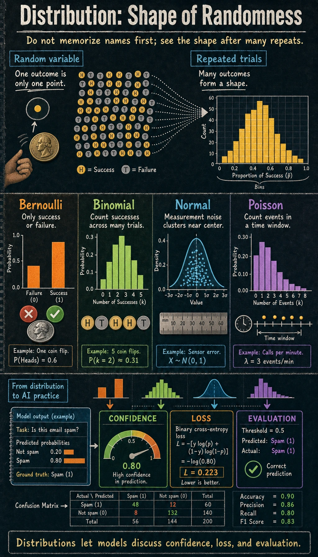
- Probability distributions focus on what the whole random phenomenon looks like
First, build a map
Section titled “First, build a map”If the previous section was about “the probability of a single event,” then this section is about:
What does an entire random phenomenon look like?
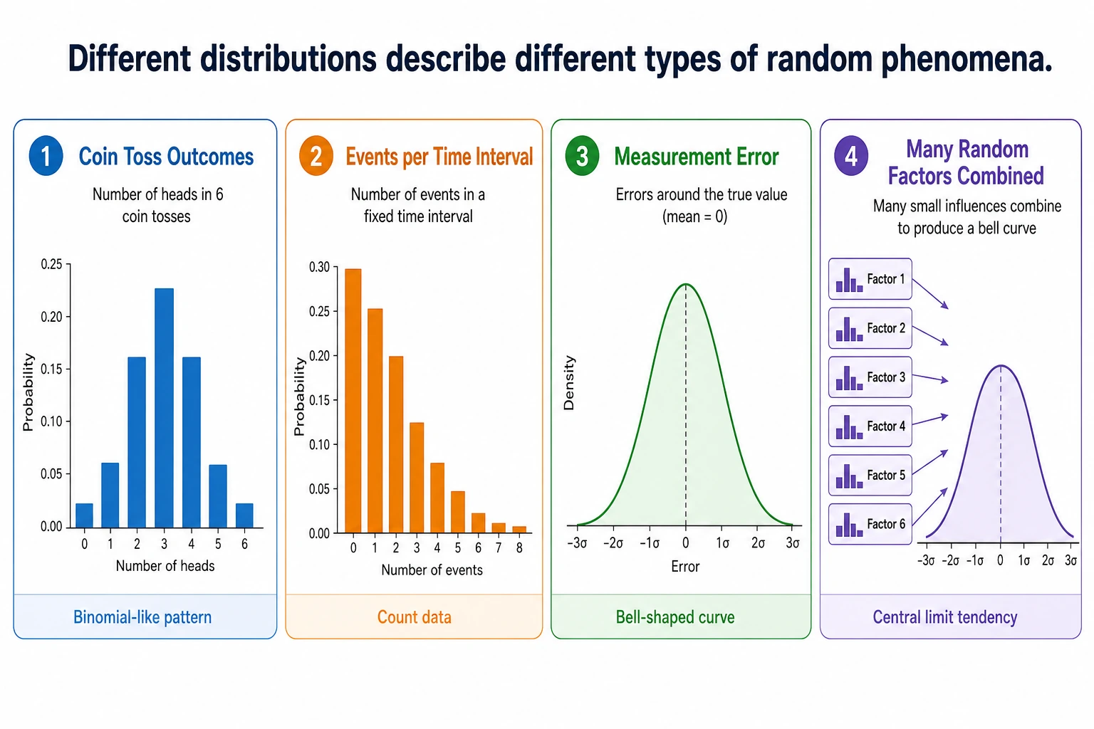
The key point of this lesson is not to memorize every distribution, but to first know:
- When a certain distribution appears
- What it roughly looks like
- Why you keep running into it in AI
What is a probability distribution?
Section titled “What is a probability distribution?”A probability distribution = all possible values of a random variable and the probability of each value.
A more beginner-friendly analogy
Section titled “A more beginner-friendly analogy”If probability is like “whether something will happen this time,” then a distribution is more like:
- A long-term, statistically estimated “map of possibilities”
flowchart TD    A["Probability distribution"]    A --> B["Discrete distribution<br/>Values are discrete (1, 2, 3...)<br/>Example: the number shown on a die"]    A --> C["Continuous distribution<br/>Values are continuous (any real number)<br/>Example: human height"]
    style A fill:#e3f2fd,stroke:#1565c0,color:#333    style B fill:#fff3e0,stroke:#e65100,color:#333    style C fill:#e8f5e9,stroke:#2e7d32,color:#333
import numpy as npimport matplotlib.pyplot as pltfrom scipy import stats
plt.rcParams['font.sans-serif'] = ['Arial Unicode MS']plt.rcParams['axes.unicode_minus'] = Falsestats is the distribution module from SciPy. In this lesson, it saves us from manually writing formulas for binomial, Poisson, and normal distributions, so we can focus on intuition.
Discrete distributions
Section titled “Discrete distributions”Bernoulli distribution — only two outcomes
Section titled “Bernoulli distribution — only two outcomes”You perform one experiment only, and the result is either “success” (1) or “failure” (0).
# Bernoulli distribution: flipping a coin once# p = probability of successp = 0.6  # unfair coin, 60% chance of heads
# Simulate 10000 timesrng = np.random.default_rng(seed=42)samples = rng.binomial(1, p, 10000)print(f"Proportion of heads: {samples.mean():.3f}")  # ≈ 0.6
fig, ax = plt.subplots(figsize=(6, 4))values, counts = np.unique(samples, return_counts=True)ax.bar(['Tails (0)', 'Heads (1)'], counts / len(samples),       color=['coral', 'steelblue'], edgecolor='white')ax.set_ylabel('Probability')ax.set_title(f'Bernoulli Distribution (p={p})')ax.set_ylim(0, 1)plt.show()
Expected output with seed=42:
Proportion of heads: 0.605Application in AI: labels for binary classification tasks follow a Bernoulli distribution (0 or 1).
Binomial distribution — the sum of multiple Bernoulli trials
Section titled “Binomial distribution — the sum of multiple Bernoulli trials”The total number of successes after n Bernoulli trials follows a binomial distribution.
# Binomial distribution: flipping a coin 20 times, counting headsn = 20   # number of trialsp = 0.5  # probability of success each time
# Theoretical distributionx = np.arange(0, n + 1)pmf = stats.binom.pmf(x, n, p)
# Simulationrng = np.random.default_rng(seed=42)samples = rng.binomial(n, p, 10000)print(f"Expected heads n*p: {n*p:.1f}")print(f"Most likely number of heads: {x[pmf.argmax()]}")print(f"Simulated mean: {samples.mean():.3f}")
fig, axes = plt.subplots(1, 2, figsize=(14, 5))
# Theoryaxes[0].bar(x, pmf, color='steelblue', edgecolor='white')axes[0].set_xlabel('Number of heads')axes[0].set_ylabel('Probability')axes[0].set_title(f'Binomial Distribution B(n={n}, p={p}) (theoretical)')
# Simulationaxes[1].hist(samples, bins=range(n+2), density=True, color='coral', edgecolor='white', alpha=0.7)axes[1].set_xlabel('Number of heads')axes[1].set_ylabel('Frequency')axes[1].set_title(f'Binomial Distribution B(n={n}, p={p}) (10,000 simulations)')
plt.tight_layout()plt.show()
Expected output with seed=42:
Expected heads n*p: 10.0Most likely number of heads: 10Simulated mean: 9.984Key parameters:
- Mean = n × p (if you flip a fair coin 20 times, the expected number of heads is 10)
- Variance = n × p × (1-p)
Poisson distribution — counting “rare events”
Section titled “Poisson distribution — counting “rare events””This is the number of times a rare event occurs in a fixed amount of time or space.
# Poisson distribution: a milk tea shop gets an average of 5 customers per hourlambda_ = 5  # average value (λ)
x = np.arange(0, 20)pmf = stats.poisson.pmf(x, lambda_)
fig, ax = plt.subplots(figsize=(8, 5))ax.bar(x, pmf, color='mediumseagreen', edgecolor='white')ax.set_xlabel('Number of customers per hour')ax.set_ylabel('Probability')ax.set_title(f'Poisson Distribution Poisson(λ={lambda_})')ax.set_xticks(x)plt.show()
print(f"Probability of 0 customers: {stats.poisson.pmf(0, lambda_):.4f}")print(f"Probability of 5 customers: {stats.poisson.pmf(5, lambda_):.4f}")print(f"Probability of 10+ customers: {1 - stats.poisson.cdf(9, lambda_):.4f}")
Expected output:
Probability of 0 customers: 0.0067Probability of 5 customers: 0.1755Probability of 10+ customers: 0.0318Application in AI: the number of rare words in a text, website traffic volume, anomaly detection.
Continuous distributions
Section titled “Continuous distributions”Uniform distribution — completely random
Section titled “Uniform distribution — completely random”Every value has exactly the same probability of occurring.
# Uniform distribution U(0, 1)rng = np.random.default_rng(seed=42)samples = rng.uniform(0, 1, 10000)print(f"Uniform sample mean: {samples.mean():.3f}")print(f"Uniform sample min/max: {samples.min():.3f}/{samples.max():.3f}")
fig, ax = plt.subplots(figsize=(8, 4))ax.hist(samples, bins=50, density=True, color='steelblue', edgecolor='white', alpha=0.7)ax.axhline(y=1, color='red', linestyle='--', label='Theoretical density = 1')ax.set_xlabel('Value')ax.set_ylabel('Probability density')ax.set_title('Uniform Distribution U(0, 1)')ax.legend()plt.show()
Expected output with seed=42:
Uniform sample mean: 0.497Uniform sample min/max: 0.000/1.000Application in AI: random weight initialization, random sampling, random transformations in data augmentation.
Normal distribution (Gaussian distribution) — the most important distribution
Section titled “Normal distribution (Gaussian distribution) — the most important distribution”Normal distribution is often called a Gaussian distribution. stats.norm.pdf(x, mu, sigma) returns the height of the bell curve at x. For continuous distributions, the height itself is not a probability; the probability is the area under the curve across an interval.
flowchart LR    N["Normal distribution<br/>N(μ, σ²)"]    N --> M["μ = mean<br/>(center of the bell curve)"]    N --> S["σ = standard deviation<br/>(how wide or narrow the curve is)"]
    style N fill:#e3f2fd,stroke:#1565c0,color:#333    style M fill:#fff3e0,stroke:#e65100,color:#333    style S fill:#fff3e0,stroke:#e65100,color:#333
fig, axes = plt.subplots(1, 2, figsize=(14, 5))
# Different meansx = np.linspace(-8, 12, 1000)for mu in [-2, 0, 3, 5]: axes[0].plot(x, stats.norm.pdf(x, mu, 1), linewidth=2, label=f'μ={mu}, σ=1')axes[0].set_title('Different means μ (different center positions)')axes[0].legend()axes[0].set_xlabel('x')axes[0].set_ylabel('Probability density')
# Different standard deviationsfor sigma in [0.5, 1, 2, 4]: axes[1].plot(x, stats.norm.pdf(x, 0, sigma), linewidth=2, label=f'μ=0, σ={sigma}')axes[1].set_title('Different standard deviations σ (different widths)')axes[1].legend()axes[1].set_xlabel('x')axes[1].set_ylabel('Probability density')
plt.tight_layout()plt.show()The 68-95-99.7 rule
Section titled “The 68-95-99.7 rule”The normal distribution has a very useful rule:
mu, sigma = 0, 1
print("68-95-99.7 rule:")for k, pct in [(1, '68.3%'), (2, '95.4%'), (3, '99.7%')]:    area = stats.norm.cdf(mu + k*sigma) - stats.norm.cdf(mu - k*sigma)    print(f"  Within μ ± {k}σ: {area:.1%} of the data (theoretical {pct})")
Expected output:
68-95-99.7 rule: Within μ ± 1σ: 68.3% of the data (theoretical 68.3%) Within μ ± 2σ: 95.4% of the data (theoretical 95.4%) Within μ ± 3σ: 99.7% of the data (theoretical 99.7%)# Visualize 68-95-99.7fig, ax = plt.subplots(figsize=(10, 5))x = np.linspace(-4, 4, 1000)y = stats.norm.pdf(x)
ax.plot(x, y, 'k-', linewidth=2)
# Fill regionscolors = ['steelblue', 'cornflowerblue', 'lightblue']labels = ['68.3% (±1σ)', '95.4% (±2σ)', '99.7% (±3σ)']for k, color, label in zip([3, 2, 1], colors[::-1], labels[::-1]): mask = (x >= -k) & (x <= k) ax.fill_between(x[mask], y[mask], alpha=0.5, color=color, label=label)
ax.set_xlabel('Standard deviations')ax.set_ylabel('Probability density')ax.set_title('The 68-95-99.7 Rule of the Normal Distribution')ax.legend(loc='upper right')plt.show()Applications of the normal distribution in AI
Section titled “Applications of the normal distribution in AI”| Use case | Description |
|---|---|
| Weight initialization | Neural network weights are often initialized with a normal distribution (such as He initialization and Xavier initialization) |
| Data standardization | Convert data to a “standard normal” distribution with mean 0 and standard deviation 1 |
| Noise modeling | Sensor noise and measurement error are often assumed to follow a normal distribution |
| Generative models | VAE and diffusion models sample from a normal distribution to generate new data |
| Anomaly detection | Data points more than 3σ away from the mean may be outliers |
The Central Limit Theorem — the most important theorem
Section titled “The Central Limit Theorem — the most important theorem”Core idea
Section titled “Core idea”No matter what the original data distribution is, the average of a large number of independent samples tends toward a normal distribution.
This is why the normal distribution appears everywhere in nature and data science — many phenomena are essentially the combined effect of many independent factors.
Verify it with code
Section titled “Verify it with code”fig, axes = plt.subplots(2, 3, figsize=(16, 10))
# Three completely different original distributionsrng = np.random.default_rng(seed=42)distributions = [ ('Uniform distribution', lambda n: rng.uniform(0, 1, n)), ('Exponential distribution', lambda n: rng.exponential(1, n)), ('Binomial distribution', lambda n: rng.binomial(10, 0.3, n)),]
for col, (name, dist_func) in enumerate(distributions): # Top: original distribution samples = dist_func(10000) axes[0, col].hist(samples, bins=50, density=True, color='coral', edgecolor='white', alpha=0.7) axes[0, col].set_title(f'Original distribution: {name}') axes[0, col].set_ylabel('Probability density')
# Bottom: take the average of 30 samples, repeat 10000 times n_samples = 30 means = np.array([dist_func(n_samples).mean() for _ in range(10000)])
axes[1, col].hist(means, bins=50, density=True, color='steelblue', edgecolor='white', alpha=0.7)
# Overlay a normal distribution curve x = np.linspace(means.min(), means.max(), 100) axes[1, col].plot(x, stats.norm.pdf(x, means.mean(), means.std()), 'r-', linewidth=2, label='Normal fit') axes[1, col].set_title(f'Distribution of sample means (n={n_samples})') axes[1, col].set_ylabel('Probability density') axes[1, col].legend() print(f"{name}: mean of sample means={means.mean():.3f}, std={means.std():.3f}")
plt.suptitle('Central Limit Theorem: No matter what the original distribution is, sample means tend toward a normal distribution', fontsize=14, y=1.01)plt.tight_layout()plt.show()Expected output with seed=42:
Uniform distribution: mean of sample means=0.500, std=0.053Exponential distribution: mean of sample means=0.999, std=0.182Binomial distribution: mean of sample means=3.005, std=0.262Interpretation: No matter whether the original data is uniform, skewed, or discrete, as long as you take the average of enough samples, the distribution will become normal.
The effect of sample size
Section titled “The effect of sample size”fig, axes = plt.subplots(1, 4, figsize=(18, 4))
# Use the exponential distribution (highly skewed) for the experimentrng = np.random.default_rng(seed=42)for ax, n in zip(axes, [1, 5, 30, 100]): means = [rng.exponential(1, n).mean() for _ in range(10000)] ax.hist(means, bins=50, density=True, color='steelblue', edgecolor='white', alpha=0.7)
x = np.linspace(min(means), max(means), 100) ax.plot(x, stats.norm.pdf(x, np.mean(means), np.std(means)), 'r-', linewidth=2) ax.set_title(f'n = {n}') ax.set_xlabel('Sample mean')
plt.suptitle('The larger the sample size, the closer the mean distribution is to normal', fontsize=13)plt.tight_layout()plt.show()Distribution overview table
Section titled “Distribution overview table”Discrete distributions count events: Bernoulli (p), Binomial (n, p), and Poisson (lambda). Continuous distributions describe ranges or measurements: Uniform (a, b), Normal (mu, sigma), and Exponential (lambda).
| When you need… | Use this distribution | NumPy call |
|---|---|---|
| A binary label or one yes/no trial | Bernoulli | rng.binomial(1, p) |
Number of successes in n trials | Binomial | rng.binomial(n, p) |
| Rare event counts in a fixed interval | Poisson | rng.poisson(lam) |
| Random values inside a range | Uniform | rng.uniform(a, b) |
| Noise or weight initialization | Normal | rng.normal(mu, sigma) |
| Time between events | Exponential | rng.exponential(1/lam) |
After learning this, what question should you take to the next section?
Section titled “After learning this, what question should you take to the next section?”After looking at distributions, the most valuable questions to carry forward are:
- If I already know what a certain distribution looks like, how do I infer its parameters from observed data?
- What does “the model that best explains the data” actually mean?
- When I see a difference in an A/B test, how can I tell whether it is a real difference or just random fluctuation?
These questions will naturally lead you to:
Evidence to Keep
Section titled “Evidence to Keep”Keep this page’s proof of learning as a small evidence card:
- Random Process
- event, distribution, sample, likelihood, entropy, or Bayes update
- Simulation Or Formula
- code or formula used to make uncertainty visible
- Output
- probability, sample statistic, interval, entropy, or updated belief
- Failure Check
- base-rate confusion, p-value misuse, sample bias, or mixing probability with certainty
- Expected Output
- numeric result plus interpretation in plain language
Summary
Section titled “Summary”| Concept | Intuition |
|---|---|
| Probability distribution | The “map of possibilities” for a random variable |
| Discrete distribution | Takes a finite set of values, each with a definite probability |
| Continuous distribution | Takes any value, described with a probability density function |
| PMF | Probability assigned to each discrete value |
| Density curve for continuous values; probabilities are areas under the curve | |
| CDF | Accumulated probability up to a value |
| Normal distribution | The most important distribution — a bell curve determined by μ and σ |
| Central Limit Theorem | Sample means tend toward a normal distribution, regardless of the original distribution |
What you should take away from this section
Section titled “What you should take away from this section”- The most important intuition about probability distributions is “what does the whole random phenomenon look like”
- Bernoulli, binomial, and Poisson are for discrete counting problems
- The normal distribution and the Central Limit Theorem will appear repeatedly later in AI
Hands-on Practice
Section titled “Hands-on Practice”Exercise 1: Plot all distributions
Section titled “Exercise 1: Plot all distributions”In a 2×3 subplot grid, plot Bernoulli, binomial, Poisson, uniform, normal, and exponential distributions.
Reference implementation:
rng = np.random.default_rng(seed=42)fig, axes = plt.subplots(2, 3, figsize=(15, 8))axes = axes.ravel()
axes[0].bar([0, 1], [0.4, 0.6], color=["coral", "steelblue"])axes[0].set_title("Bernoulli(p=0.6)")
x = np.arange(0, 21)axes[1].bar(x, stats.binom.pmf(x, 20, 0.5), color="steelblue")axes[1].set_title("Binomial(n=20, p=0.5)")
x = np.arange(0, 16)axes[2].bar(x, stats.poisson.pmf(x, 5), color="mediumseagreen")axes[2].set_title("Poisson(lambda=5)")
samples = rng.uniform(0, 1, 10000)axes[3].hist(samples, bins=40, density=True, color="steelblue", alpha=0.7)axes[3].set_title("Uniform(0, 1)")
x = np.linspace(-4, 4, 300)axes[4].plot(x, stats.norm.pdf(x), color="black")axes[4].set_title("Normal(0, 1)")
samples = rng.exponential(1, 10000)axes[5].hist(samples, bins=40, density=True, color="orange", alpha=0.7)axes[5].set_title("Exponential(scale=1)")
plt.tight_layout()plt.show()
Exercise 2: Verify 68-95-99.7
Section titled “Exercise 2: Verify 68-95-99.7”Generate 100000 height data points from N(170, 5) (mean 170 cm, standard deviation 5 cm), and verify what proportion of people have heights between 160 and 180 cm (±2σ).
Reference implementation:
rng = np.random.default_rng(seed=42)heights = rng.normal(170, 5, 100000)within = ((heights >= 160) & (heights <= 180)).mean()print(f"Height within 160-180 cm: {within:.1%}")Expected output:
Height within 160-180 cm: 95.4%Exercise 3: Central Limit Theorem experiment
Section titled “Exercise 3: Central Limit Theorem experiment”Use dice (uniform distribution from 1 to 6) to perform a Central Limit Theorem experiment: roll the dice 1 time, 10 times, 50 times, and 200 times, compute the average each time, repeat each group 10000 times, and plot the distribution of the averages.
Reference implementation:
rng = np.random.default_rng(seed=42)for n_rolls in [1, 10, 50, 200]: means = rng.integers(1, 7, size=(10000, n_rolls)).mean(axis=1) print(f"Dice n={n_rolls}: mean={means.mean():.3f}, std={means.std():.3f}")Expected output:
Dice n=1: mean=3.475, std=1.704Dice n=10: mean=3.503, std=0.541Dice n=50: mean=3.499, std=0.241Dice n=200: mean=3.500, std=0.120The mean stays close to 3.5, while the standard deviation of the averages becomes smaller. That is the Central Limit Theorem becoming visible in code.
Operation guide and checkpoints
- The six-panel distribution plot should make the difference between discrete counts and continuous measurements visible. Bars are natural for Bernoulli, binomial, and Poisson; curves or histograms fit continuous distributions.
- For heights from
N(170,5), the interval 160 to 180 cm is within two standard deviations, so the simulated proportion should be close to95%. - When the sample mean experiment uses larger sample sizes, its distribution should become narrower and more normal-looking. That is the practical face of the Central Limit Theorem.