
3.4.5 Visualization Best Practices
Learning objectives
Section titled “Learning objectives”- Master strategies for choosing chart types
- Understand color principles and color-blind-friendly design
- Understand the concept of “data-ink ratio”
- Identify and avoid common visualization misleading techniques
First, build a map
Section titled “First, build a map”It’s easier to understand visualization best practices in the order “communication goal -> chart choice -> reduce distractions -> prevent misleading”:
flowchart LR A["What do I want to express?"] --> B["Choose the right chart"] B --> C["Use good colors and layout"] C --> D["Remove unnecessary decoration"] D --> E["Make sure it is not misleading"]So what this section really wants to solve is:
- why making a chart does not automatically make it clear
- why many bad charts are not a code problem, but a communication-logic problem
Why learn best practices?
Section titled “Why learn best practices?”With the same data, good visualization lets people understand it in one second, while bad visualization makes people more and more confused, or even misleads them.
flowchart LR    A["Raw data"] --> B{"Visualization"}    B -->|Good practice| C["Clear · Accurate · Beautiful<br/>Readers understand quickly"]    B -->|Poor practice| D["Messy · Misleading · Ugly<br/>Readers are confused"]
    style C fill:#e8f5e9,stroke:#2e7d32,color:#333    style D fill:#ffebee,stroke:#c62828,color:#333
A better beginner-friendly analogy
Section titled “A better beginner-friendly analogy”You can think of a chart as:
- a very short presentation
A good chart is like a clear presentation:
- you immediately know the key point
A bad chart is like:
- too much talk
- too much decoration
- but after hearing it, you still do not know the key point
So the most important thing in best practices is not “looking nice,” but:
- whether the information is easier to understand
Chart type selection guide
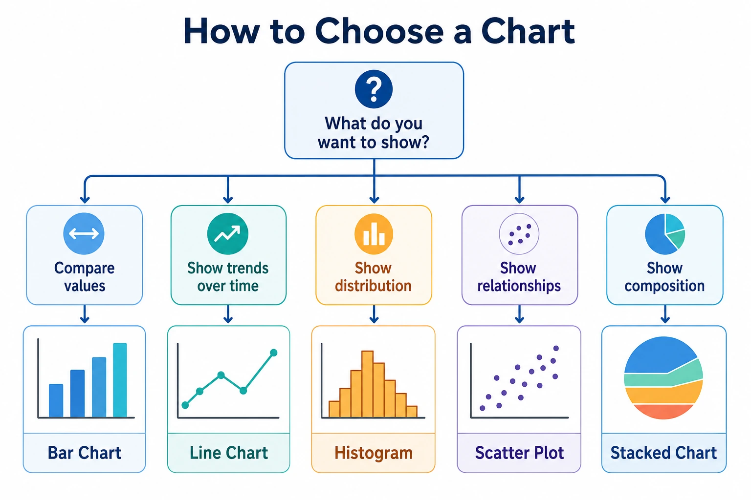
Section titled “Chart type selection guide”Core principle: first ask yourself, “What do I want to show?”
Section titled “Core principle: first ask yourself, “What do I want to show?””flowchart TD Q["What do I want to show?"]
Q --> T["Trend change"] Q --> C["Category comparison"] Q --> R["Relationship / correlation"] Q --> D["Data distribution"] Q --> P["Proportion / composition"]
T --> T1["Line chart<br/>Suitable for time series"] T --> T2["Area chart<br/>Emphasizes accumulation"]
C --> C1["Bar chart<br/>Most commonly used"] C --> C2["Horizontal bar chart<br/>Use when labels are long"] C --> C3["Radar chart<br/>Multidimensional scoring"]
R --> R1["Scatter plot<br/>Relationship between two variables"] R --> R2["Heatmap<br/>Matrix relationships"] R --> R3["Bubble chart<br/>Relationship among three variables"]
D --> D1["Histogram<br/>Check frequency"] D --> D2["Box plot<br/>Distribution + outliers"] D --> D3["Violin plot<br/>Distribution shape"]
P --> P1["Pie chart<br/>Few-category proportions"] P --> P2["Stacked bar chart<br/>Multi-category proportions"] P --> P3["Treemap<br/>Hierarchical proportions"]
style Q fill:#e3f2fd,stroke:#1565c0,color:#333 style T fill:#fff3e0,stroke:#e65100,color:#333 style C fill:#e8f5e9,stroke:#2e7d32,color:#333 style R fill:#f3e5f5,stroke:#7b1fa2,color:#333 style D fill:#fff8e1,stroke:#f57f17,color:#333 style P fill:#fce4ec,stroke:#c62828,color:#333Detailed chart selection table
Section titled “Detailed chart selection table”| My goal | Recommended chart | Not recommended | Explanation |
|---|---|---|---|
| Show time trend | Line chart | Pie chart | Line charts are naturally suited to continuous change |
| Compare several categories | Bar chart | Pie chart (more than 6 categories) | Bar heights are easy to compare at a glance |
| See the relationship between two variables | Scatter plot | Line chart | Scatter plots show distribution and trends more directly |
| Check data distribution | Histogram / box plot | Line chart | Histograms show frequency distribution |
| Show proportion | Pie chart (few categories) / stacked bar chart | 3D pie chart | 3D pie charts distort area |
| Compare distribution differences | Box plot / violin plot | Only mean-value bar chart | Mean bars lose distribution information |
| Show a correlation matrix | Heatmap | Table | Color coding is more intuitive than numbers |
Five questions worth remembering before you start drawing
Section titled “Five questions worth remembering before you start drawing”Before you actually start making a chart, ask yourself:
- Am I showing trend, comparison, distribution, or relationship?
- Is this chart for my own exploration, or for reporting to others?
- What should the reader notice first?
- Which decorations can actually be removed?
- Could this chart mislead people?
These 5 questions are more important than many plotting library parameters.
Color principles
Section titled “Color principles”Three uses of color
Section titled “Three uses of color”| Use | Scenario | Example |
|---|---|---|
| Categorical (qualitative color) | Distinguish different categories | Male/female in different colors |
| Sequential (continuous color) | Represent magnitude | Temperature from blue to red |
| Diverging (two-sided color) | Data with a center value | Correlation coefficients from -1 to 1 |
Recommended color palettes
Section titled “Recommended color palettes”import matplotlib.pyplot as pltimport seaborn as sns
# === Categorical colors (distinguish categories)===# Matplotlib default palette (Tab10)# Colors: blue, orange, green, red, purple, brown, pink, gray, yellow-green, cyan# Suitable for: up to 10 categories
# Seaborn palettessns.color_palette("Set2") # Soft tonessns.color_palette("colorblind") # Color-blind-friendly!
# === Sequential colors (show magnitude)===# From light to dark# "Blues", "Greens", "Reds", "YlOrRd" (yellow-orange-red)
# === Diverging colors (has a center value)===# "RdBu_r" (red-white-blue) — often used for correlation coefficients# "RdYlGn" (red-yellow-green) — shows good/badColor-blind-friendly design
Section titled “Color-blind-friendly design”About 8% of men worldwide have color vision deficiency (the most common is red-green color blindness).
Combinations to avoid:
| Avoid | Why | Alternative |
|---|---|---|
| Red + green | People with red-green color blindness cannot distinguish them | Blue + orange |
| Relying only on color | Color-blind readers cannot see the difference | Color + shape / line style |
Recommended practice:
# Use a color-blind-friendly palettesns.set_palette("colorblind")
# Or use different marker shapes + colorsmarkers = ["o", "s", "^", "D"]  # Circle, square, triangle, diamondlinestyles = ["-", "--", ":", "-."]  # Solid, dashed, dotted, dash-dot
# Example: dual encoding with color + line stylefig, ax = plt.subplots()for i, (style, marker) in enumerate(zip(linestyles, markers)): ax.plot(range(10), [x + i*2 for x in range(10)], linestyle=style, marker=marker, label=f"Series {i+1}")ax.legend()plt.show()Data-ink ratio
Section titled “Data-ink ratio”What is the data-ink ratio?
Section titled “What is the data-ink ratio?”This concept comes from visualization master Edward Tufte:
Data-ink ratio = ink used to display data / all ink used in the chart
Simply put: remove all unnecessary decoration so that every drop of ink serves the data.
Reduce “chart junk”
Section titled “Reduce “chart junk””flowchart TD A["Elements in a chart"] --> B["Data ink<br/>(meaningful)"] A --> C["Non-data ink<br/>(can be removed)"]
B --> B1["Data points / lines / bars"] B --> B2["Meaningful labels"] B --> B3["Necessary axes"]
C --> C1["3D effects"] C --> C2["Excessive grid lines"] C --> C3["Fancy background"] C --> C4["Unnecessary borders"] C --> C5["Decorative patterns"]
style B fill:#e8f5e9,stroke:#2e7d32,color:#333 style C fill:#ffebee,stroke:#c62828,color:#333Practical comparison
Section titled “Practical comparison”Bad practice (low data-ink ratio):
# ❌ Over-decoratedfig, ax = plt.subplots(figsize=(8, 5))values = [25, 40, 30, 55, 45]categories = ["A", "B", "C", "D", "E"]
ax.bar(categories, values, color="skyblue", edgecolor="navy", linewidth=2, hatch="//")ax.set_facecolor("#f0f0f0")          # Background colorax.grid(True, linewidth=2, alpha=1)  # Heavy gridax.set_title("Sales Data", fontsize=20, fontweight="bold",             fontstyle="italic", color="red")# Too much decoration makes the data less prominentplt.show()
Good practice (high data-ink ratio):
# ✅ Clean and clearfig, ax = plt.subplots(figsize=(8, 5))
bars = ax.bar(categories, values, color="#4CAF50", width=0.6)
# Put values directly on the bars (reduces dependence on the axis)for bar, val in zip(bars, values):    ax.text(bar.get_x() + bar.get_width()/2, bar.get_height() + 1,            str(val), ha="center", fontsize=12)
ax.set_title("Sales Data", fontsize=14)ax.spines["top"].set_visible(False)     # Remove top borderax.spines["right"].set_visible(False)   # Remove right borderax.set_ylabel("Sales")
plt.tight_layout()plt.show()
Simplification checklist
Section titled “Simplification checklist”| Element | Keep? | Reason |
|---|---|---|
| Top/right borders | Remove | No information value |
| Dense grid lines | Remove or soften | Use alpha=0.2 |
| 3D effects | Remove | Distort proportions |
| Data labels | As needed | Sometimes more intuitive than the axis |
| Legend | As needed | Not needed when there is only one series |
| Background color | White background | Least distracting |
A minimal clean template that beginners can remember first
Section titled “A minimal clean template that beginners can remember first”If you are not sure how to make a chart look more “professional,” you can start with these defaults:
- White background
- Remove top and right borders
- Make grid lines lighter
- Let the title say only the key point
- Use fewer exaggerated colors
Charts made this way are usually already clearer than many “carefully decorated” versions.
Evidence to Keep
Section titled “Evidence to Keep”Keep this page’s proof of learning as a small evidence card:
- Question
- what comparison, distribution, trend, or relationship the chart answers
- Chart Choice
- line, bar, scatter, histogram, box, heatmap, or interactive dashboard
- Artifact
- saved chart image/html plus the data slice used
- Failure Check
- misleading scale, overloaded chart, wrong aggregation, or missing labels
- Expected Output
- chart artifact with one sentence explaining the insight
Common visualization misleading techniques
Section titled “Common visualization misleading techniques”Misleading 1: Truncating the Y-axis
Section titled “Misleading 1: Truncating the Y-axis”The sales of three products are 98, 99, and 100 — almost the same. But if the Y-axis does not start at 0:
Truncated Y-axis (starting from 97) — looks like a huge difference:
xychart-beta title "Truncated Y-axis (starts at 97)" x-axis ["Product A", "Product B", "Product C"] y-axis "Sales" 97 --> 101 bar [98, 99, 100]Product C looks 3 times taller than Product A! But in reality it is only 2% higher.
Y-axis starts at 0 — true proportions:
xychart-beta title "Y-axis starts at 0 (true proportions)" x-axis ["Product A", "Product B", "Product C"] y-axis "Sales" 0 --> 110 bar [98, 99, 100]When the axis starts at 0, the three bars are almost the same height — that is the true picture of the data.
Code comparison:
import matplotlib.pyplot as plt
fig, axes = plt.subplots(1, 2, figsize=(12, 4))
data = [98, 99, 100]labels = ["Product A", "Product B", "Product C"]
# ❌ Misleading: truncated Y-axisaxes[0].bar(labels, data, color="#F44336")axes[0].set_ylim(97, 101)  # Y-axis starts at 97!axes[0].set_title("❌ Truncated Y-axis (starts at 97)")axes[0].set_ylabel("Sales")
# ✅ Correct: start at 0axes[1].bar(labels, data, color="#4CAF50")axes[1].set_ylim(0, 110)axes[1].set_title("✅ Y-axis starts at 0")axes[1].set_ylabel("Sales")
plt.tight_layout()plt.show()Misleading 2: 3D pie charts
Section titled “Misleading 2: 3D pie charts”3D pie charts make the part closer to the viewer look larger:
# ❌ 3D pie chart# Matplotlib does not actually have a real 3D pie chart, but this shows the idea:# slices in front appear larger due to perspective, and slices in back appear smaller# causing readers to judge proportions incorrectly
# ✅ Correct approach: use a 2D pie chart or a bar chart insteadfig, axes = plt.subplots(1, 2, figsize=(12, 5))
labels = ["Python", "Java", "JS", "C++"]sizes = [35, 25, 25, 15]
axes[0].pie(sizes, labels=labels, autopct="%1.0f%%")axes[0].set_title("2D Pie Chart (clear)")
axes[1].barh(labels, sizes, color=["#4CAF50", "#2196F3", "#FFC107", "#FF5722"])axes[1].set_xlabel("Proportion (%)")axes[1].set_title("Bar Chart (more precise comparison)")
plt.tight_layout()plt.show()
Misleading 3: Dual Y-axis trap
Section titled “Misleading 3: Dual Y-axis trap”# ❌ Dual Y-axes may suggest a correlation that does not really existfig, ax1 = plt.subplots(figsize=(8, 5))
months = range(1, 13)temp = [5, 7, 12, 18, 23, 28, 30, 29, 24, 17, 10, 6]ice_cream = [20, 25, 35, 50, 70, 90, 95, 88, 60, 40, 22, 18]
ax1.plot(months, temp, "r-", label="Temperature")ax1.set_ylabel("Temperature (°C)", color="r")
ax2 = ax1.twinx()ax2.plot(months, ice_cream, "b-", label="Ice cream sales")ax2.set_ylabel("Ice cream sales", color="b")
ax1.set_title("Temperature vs Ice Cream Sales")plt.show()
# There is indeed a correlation here, but the scale of dual Y-axes can be adjusted arbitrarily# making the two lines look perfectly aligned or completely unrelated# A scatter plot is a more honest way to show correlationMisleading 4: Incorrect area/size mapping
Section titled “Misleading 4: Incorrect area/size mapping”# ❌ Using diameter instead of area to represent quantity# If A = 100, B = 200# doubling the diameter -> area becomes 4 times larger -> readers think B is 4 times A
# ✅ Correct approach: map values to areaimport numpy as np
values = [100, 200, 300]# Area should be proportional to the value, so radius should be proportional to sqrt(value)sizes = [v * 2 for v in values] # Area proportionalSummary of common misleading techniques
Section titled “Summary of common misleading techniques”| Misleading method | Why it misleads | Correct approach |
|---|---|---|
| Truncated Y-axis | Exaggerates differences | Bar charts start at 0 |
| 3D pie chart | Distorts area proportions | Use 2D pie charts or bar charts |
| Dual Y-axis | Allows visual correlation to be manipulated | Use scatter plots or separate charts |
| Incorrect area usage | Distorts size perception | Make area proportional to the value |
| Selective display | Hides unfavorable data | Show complete data |
| Color manipulation | Bright colors emphasize small data | Use neutral colors as the main palette |
Full checklist
Section titled “Full checklist”After finishing a chart, check it with this list:
- Chart type matches the question: line, bar, scatter, or another appropriate choice.
- Title states the message, not just the variable name.
- Axes have labels, units, and a reasonable start value.
- Legend, colors, and labels help reading instead of adding clutter.
- Font size is readable for another person.
- The chart is honest: no hidden data, distorted scale, or misleading decoration.
The safest default order for your first reporting chart
Section titled “The safest default order for your first reporting chart”A more stable order is usually:
- Choose the right chart first
- Then make the title and axes clear
- Then remove extra decoration
- Finally, check whether anything is misleading
This is less likely to go off track than worrying about colors and shadows from the very beginning.
From “usable” to “easy to use” templates
Section titled “From “usable” to “easy to use” templates”Minimal professional template
Section titled “Minimal professional template”import matplotlib.pyplot as pltimport numpy as np
def professional_style(ax): """One-click professional styling""" ax.spines["top"].set_visible(False) ax.spines["right"].set_visible(False) ax.grid(True, axis="y", alpha=0.2, linestyle="--") ax.tick_params(labelsize=10)
# Use the templatefig, ax = plt.subplots(figsize=(8, 5))
categories = ["Product A", "Product B", "Product C", "Product D", "Product E"]values = [42, 38, 55, 29, 47]
bars = ax.bar(categories, values, color="#1976D2", width=0.6)
# Data labelsfor bar, val in zip(bars, values): ax.text(bar.get_x() + bar.get_width()/2, bar.get_height() + 1, f"{val}k", ha="center", fontsize=11)
ax.set_title("2024 Sales of Each Product", fontsize=14, pad=15)ax.set_ylabel("Sales (ten thousand yuan)")ax.set_ylim(0, max(values) * 1.15)
professional_style(ax)plt.tight_layout()plt.show()Seaborn minimal template
Section titled “Seaborn minimal template”import seaborn as snsimport matplotlib.pyplot as plt
# Global settingssns.set_theme( style="ticks", # Minimal tick style palette="colorblind", # Color-blind-friendly rc={ "figure.figsize": (8, 5), "axes.spines.top": False, # Remove top border "axes.spines.right": False, # Remove right border "font.size": 11, })
# All later sns/plt charts will use this styleSummary
Section titled “Summary” root(("Visualization<br/>Best Practices")) Choose the right chart Trend→Line chart Comparison→Bar chart Relationship→Scatter plot Distribution→Histogram/box plot Proportion→Pie chart/stacked bar chart Use color well Categorical colors distinguish categories Sequential colors show magnitude Diverging colors show deviation Color-blind-friendly Dual encoding Reduce decoration High data-ink ratio Remove 3D effects Remove unnecessary borders Soften grids Do not mislead Start Y-axis at 0 Area proportional to value Show data completely Be careful with dual Y-axesThree core sentences:
- Choose the right chart — let the data decide the chart type, not the other way around
- Less is more — remove everything that does not serve the data
- Present honestly — do not exaggerate, hide, or mislead
What you should take away from this section
Section titled “What you should take away from this section”- The core of best practices is not “prettier,” but “clearer and more honest”
- Choosing the right chart matters much more than adding lots of styling
- The biggest visualization danger is not being flashy enough, but making people focus on the wrong thing
Hands-on exercises
Section titled “Hands-on exercises”Exercise 1: Improve an “ugly chart”
Section titled “Exercise 1: Improve an “ugly chart””# The chart below has many problems. Please transform it into a professional version:import matplotlib.pyplot as plt
fig, ax = plt.subplots()data = [45, 52, 38, 67, 41]labels = ["Beijing", "Shanghai", "Guangzhou", "Shenzhen", "Hangzhou"]
ax.bar(labels, data, color=["red", "green", "blue", "yellow", "purple"], edgecolor="black", linewidth=3, hatch="xxx")ax.set_ylim(30, 70) # Truncated Y-axis!ax.set_facecolor("#cccccc")ax.grid(True, linewidth=3)ax.set_title("SALES DATA!!!", fontsize=24, color="red")plt.show()
# Problem list:# 1. Y-axis does not start at 0 (misleading)# 2. Colors are flashy and inconsistent# 3. Background color is distracting# 4. Grid is too thick# 5. Title is unclear# 6. Borders are unnecessary# Please fix them one by one!Exercise 2: Chart selection practice
Section titled “Exercise 2: Chart selection practice”Please choose the appropriate chart type for each scenario and explain why:
1. Show the annual revenue change of a company from 2018 to 20242. Compare the average housing prices of 5 cities3. Analyze the relationship between advertising spending and sales4. Check the age distribution of 1,000 employees5. Show the employee proportion of each department in a company (4 departments)6. Compare the distribution differences among three groups of experimental dataExercise 3: Color-blind-friendly redesign
Section titled “Exercise 3: Color-blind-friendly redesign”# Transform the following chart into a color-blind-friendly version# Requirement: use a color-blind-safe palette + dual encoding with different line styles/markers
fig, ax = plt.subplots()x = range(10)ax.plot(x, [i**1.5 for i in x], color="red", label="Model A")ax.plot(x, [i**1.3 for i in x], color="green", label="Model B")ax.plot(x, [i**1.1 for i in x], color="red", alpha=0.5, label="Model C") # Too similar to A!ax.legend()plt.show()Reference implementation and walkthrough
- For the misleading chart repair, start the y-axis at zero when comparing bar lengths, remove unnecessary 3D or heavy backgrounds, and write a title that states the question or finding.
- Chart choice should follow the data shape: line for time trend, bar for category comparison, scatter for two numeric variables, histogram for one numeric distribution, and box or violin for grouped distributions.
- Accessible charts use enough contrast, avoid relying on red/green alone, and include labels or annotations where the reader would otherwise have to guess.