
3.4.2 Matplotlib Basics
Learning objectives
Section titled “Learning objectives”- Understand the object model of Figure and Axes
- Master 5 basic chart types
- Learn how to customize chart elements (title, legend, grid, etc.)
- Master subplot layouts
First, build a map
Section titled “First, build a map”When learning Matplotlib for the first time, the safest order is not “memorize all the functions first,” but to first see how a chart usually comes together:
flowchart LR A["First ask what you want to express"] --> B["Choose a chart type"] B --> C["Create Figure / Axes"] C --> D["Plot the data"] D --> E["Add title, labels, legend"] E --> F["Then style and save"]So what this section really wants to solve is:
- What is the most basic plotting action?
- Why does the
Figure / Axesmodel become the foundation for all later charts?
Why learn visualization?
Section titled “Why learn visualization?”“A picture is worth a thousand words.”
For the same data—
- In a table:
Average salary: Technical Dept 18667, Marketing Dept 19000, Management Dept 32500 - In a chart: you can immediately see that the Management Dept salary is much higher than the others
The purpose of data visualization is to let data speak, so people can understand the patterns and story behind it within seconds.
A better beginner-friendly analogy
Section titled “A better beginner-friendly analogy”You can think of Matplotlib as:
- a basic toolbox for drawing charts
It is not like Seaborn, which already gives you many default styles,
but its advantage is:
- you can truly see how a chart is built step by step
So the value of learning Matplotlib is not only to be able to draw charts,
but also to build an intuition for:
- how a chart is made up of data, canvas, and axes
Installation and import
Section titled “Installation and import”# Install (usually already included)# python -m pip install --upgrade matplotlib
import matplotlib.pyplot as pltimport numpy as np
# Show charts in Jupyter Notebook# %matplotlib inlineYour first chart: 5 lines of code
Section titled “Your first chart: 5 lines of code”import matplotlib.pyplot as plt
x = [1, 2, 3, 4, 5]y = [2, 4, 6, 8, 10]
plt.plot(x, y) # Draw a line chartplt.title("My First Chart") # Titleplt.show() # Display the chartThat’s it! You will see a straight line rising from the lower left to the upper right.
The most important order to remember when plotting for the first time
Section titled “The most important order to remember when plotting for the first time”When drawing any chart for the first time, a safer order is usually:
- Prepare
xandyfirst - Draw the most basic version first
- Add the title and labels next
- Finally add the legend, colors, and styling
This is usually much easier than trying to study color schemes and styles from the very beginning.
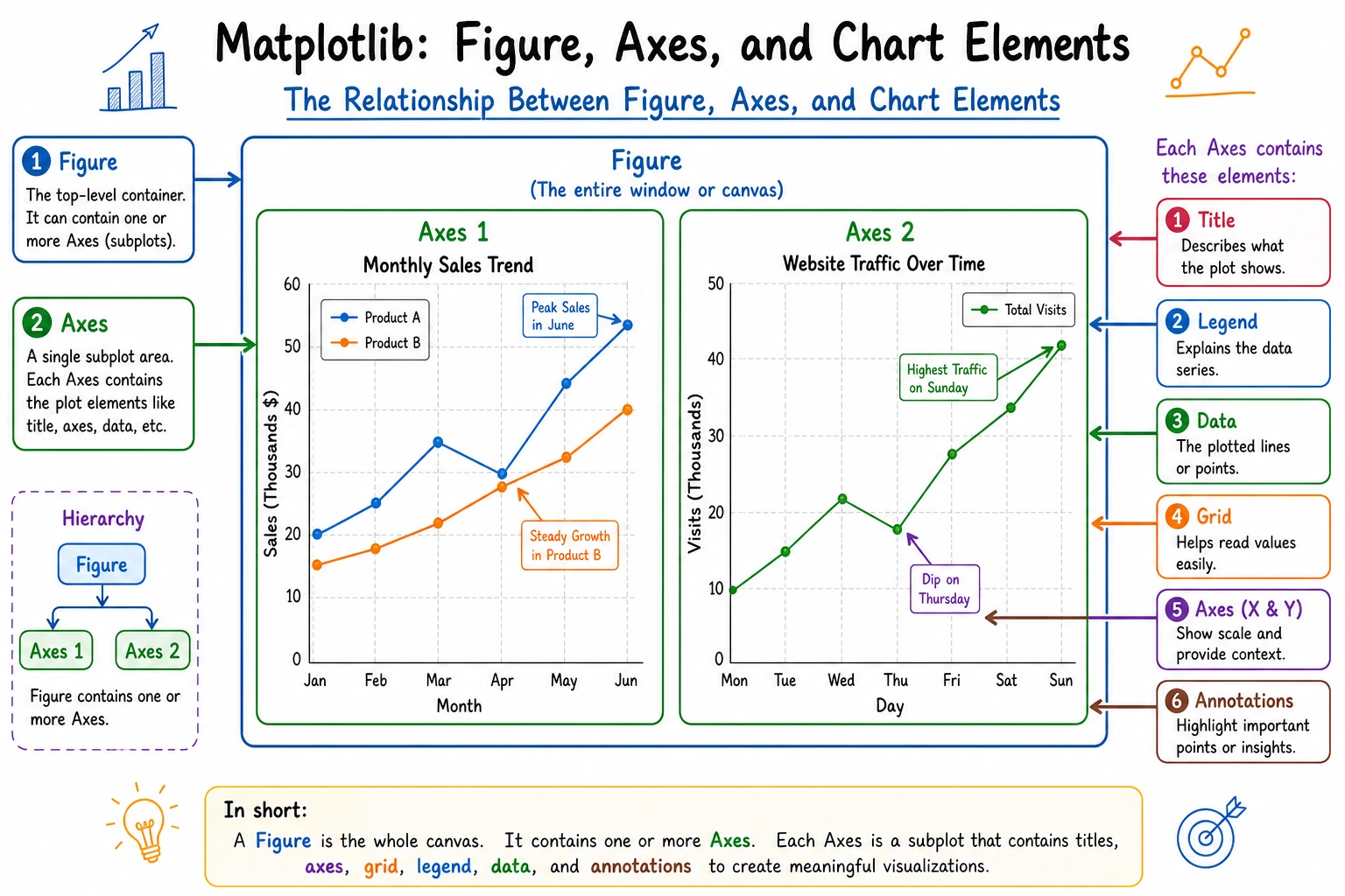
Core concepts: Figure and Axes
Section titled “Core concepts: Figure and Axes”Matplotlib charts are built from two core objects:
flowchart TD    F["Figure (canvas)<br/>Container for the whole chart"] --> A1["Axes (subplot 1)<br/>The actual plotting area"]    F --> A2["Axes (subplot 2)"]    F --> A3["Axes (subplot 3)"]
    A1 --> T1["Title"]    A1 --> X1["X-axis label"]    A1 --> Y1["Y-axis label"]    A1 --> L1["Legend"]    A1 --> D1["Data line/points/bars"]
style F fill:#e3f2fd,stroke:#1565c0,color:#333 style A1 fill:#fff3e0,stroke:#e65100,color:#333 style A2 fill:#fff3e0,stroke:#e65100,color:#333 style A3 fill:#fff3e0,stroke:#e65100,color:#333- Figure: the whole canvas, which can contain multiple subplots
- Axes: one specific chart area (note: not “axis,” but “subplot”)
Two plotting styles
Section titled “Two plotting styles”# Style 1: quick plotting with plt (good for simple cases)plt.plot([1, 2, 3], [4, 5, 6])plt.title("Quick Plotting")plt.show()
# Style 2: object-oriented style (recommended, more flexible)fig, ax = plt.subplots() # Create the canvas and subplotax.plot([1, 2, 3], [4, 5, 6]) # Plot on the subplotax.set_title("Object-Oriented Plotting") # Set the titleplt.show()5 basic chart types
Section titled “5 basic chart types”First, do not memorize functions blindly—first remember what each one is best for
Section titled “First, do not memorize functions blindly—first remember what each one is best for”| Chart | What it is best for |
|---|---|
| Line chart | Showing trends |
| Bar chart | Comparing categories |
| Scatter plot | Showing relationships |
| Histogram | Showing distribution |
| Pie chart | Showing proportions (with only a few categories) |
This table is especially important for beginners because it turns “function names” back into “communication tasks.”
Line Plot
Section titled “Line Plot”Best for: showing how data changes over time or another continuous variable
import matplotlib.pyplot as pltimport numpy as np
# Simulate sales data for 12 monthsmonths = np.arange(1, 13)sales_2023 = [120, 135, 150, 180, 200, 210, 195, 188, 220, 250, 280, 310]sales_2024 = [140, 155, 170, 195, 230, 245, 225, 210, 260, 290, 320, 350]
fig, ax = plt.subplots(figsize=(10, 6))  # Set canvas size
ax.plot(months, sales_2023, marker="o", label="2023", color="#2196F3", linewidth=2)ax.plot(months, sales_2024, marker="s", label="2024", color="#FF5722", linewidth=2)
ax.set_title("Monthly Sales Trend", fontsize=16, fontweight="bold")ax.set_xlabel("Month", fontsize=12)ax.set_ylabel("Sales (10k yuan)", fontsize=12)ax.set_xticks(months)ax.set_xticklabels([f"{m}" for m in months])ax.legend(fontsize=12)     # Show legendax.grid(True, alpha=0.3)   # Show grid lines
plt.tight_layout()  # Automatically adjust marginsplt.show()
Key parameters:
| Parameter | Purpose | Example |
|---|---|---|
marker | Data point marker | "o" circle, "s" square, "^" triangle |
linestyle | Line style | "-" solid, "--" dashed, ":" dotted |
linewidth | Line width | 2 |
color | Color | "red", "#FF5722", "C0" |
label | Legend label | "2023" |
alpha | Transparency | 0.7 (0 fully transparent, 1 fully opaque) |
Bar Chart
Section titled “Bar Chart”Best for: comparing values across different categories
# Salary comparison across departmentsdepartments = ["Technical Dept", "Marketing Dept", "Management Dept", "Finance Dept", "HR Dept"]avg_salary = [18500, 16200, 28000, 15800, 14500]
fig, ax = plt.subplots(figsize=(8, 5))
bars = ax.bar(departments, avg_salary, color=["#4CAF50", "#2196F3", "#FF9800", "#9C27B0", "#607D8B"])
# Show values above each barfor bar, val in zip(bars, avg_salary):    ax.text(bar.get_x() + bar.get_width()/2, bar.get_height() + 300,            f"¥{val:,}", ha="center", fontsize=10)
ax.set_title("Average Salary by Department", fontsize=14)ax.set_ylabel("Salary (yuan)")ax.set_ylim(0, max(avg_salary) * 1.15)  # Leave space for value labels on the Y-axis
plt.tight_layout()plt.show()
Horizontal bar chart (better when labels are long):
fig, ax = plt.subplots(figsize=(8, 5))ax.barh(departments, avg_salary, color="#4CAF50")ax.set_xlabel("Salary (yuan)")ax.set_title("Average Salary by Department")plt.tight_layout()plt.show()Grouped bar chart:
# Two-year comparisonx = np.arange(len(departments))width = 0.35
fig, ax = plt.subplots(figsize=(10, 5))ax.bar(x - width/2, [17000, 15000, 26000, 14500, 13000], width, label="2023", color="#64B5F6")ax.bar(x + width/2, avg_salary, width, label="2024", color="#1565C0")
ax.set_xticks(x)ax.set_xticklabels(departments)ax.legend()ax.set_title("Department Salary Comparison (2023 vs 2024)")plt.tight_layout()plt.show()
Scatter Plot
Section titled “Scatter Plot”Best for: observing the relationship between two variables
rng = np.random.default_rng(seed=42)
# Simulate height and weight dataheight = rng.normal(170, 8, 100)weight = height * 0.65 - 40 + rng.normal(0, 5, 100)
fig, ax = plt.subplots(figsize=(8, 6))
scatter = ax.scatter(height, weight, c=weight, cmap="RdYlGn_r",                     s=50, alpha=0.7, edgecolors="white", linewidth=0.5)
ax.set_title("Relationship Between Height and Weight", fontsize=14)ax.set_xlabel("Height (cm)")ax.set_ylabel("Weight (kg)")
plt.colorbar(scatter, label="Weight")  # Color barplt.tight_layout()plt.show()
Key parameters:
| Parameter | Purpose | Example |
|---|---|---|
s | Point size | 50, or pass an array for varying sizes |
c | Point color | "red", or pass an array for color mapping |
cmap | Colormap | "viridis", "RdYlGn", "Blues" |
alpha | Transparency | 0.7 |
Histogram
Section titled “Histogram”Best for: viewing the distribution of data
rng = np.random.default_rng(seed=42)scores = rng.normal(75, 12, 500)  # Scores of 500 students
fig, ax = plt.subplots(figsize=(8, 5))
# Draw histogramn, bins, patches = ax.hist(scores, bins=20, color="#42A5F5", edgecolor="white",                            alpha=0.8)
# Add mean linemean_val = scores.mean()ax.axvline(mean_val, color="red", linestyle="--", linewidth=2, label=f"Mean: {mean_val:.1f}")
ax.set_title("Student Score Distribution", fontsize=14)ax.set_xlabel("Score")ax.set_ylabel("Number of students")ax.legend()
plt.tight_layout()plt.show()
Pie Chart
Section titled “Pie Chart”Best for: showing parts of a whole (categories should not exceed 5–6)
labels = ["Python", "JavaScript", "Java", "C++", "Others"]sizes = [35, 25, 20, 10, 10]colors = ["#4CAF50", "#FFC107", "#2196F3", "#FF5722", "#9E9E9E"]explode = (0.05, 0, 0, 0, 0)  # Highlight Python
fig, ax = plt.subplots(figsize=(7, 7))
ax.pie(sizes, explode=explode, labels=labels, colors=colors,       autopct="%1.1f%%", startangle=90, shadow=False,       textprops={"fontsize": 12})
ax.set_title("Programming Language Usage in AI", fontsize=14)
plt.tight_layout()plt.show()Chart selection guide
Section titled “Chart selection guide”flowchart TD A["What do I want to show?"] --> B{"Data type"} B -->|"Trend changes"| C["Line chart 📈"] B -->|"Category comparison"| D["Bar chart 📊"] B -->|"Relationship between two variables"| E["Scatter plot 🔵"] B -->|"Data distribution"| F["Histogram 📉"] B -->|"Proportion structure"| G["Pie chart 🥧"]
C --> C1["Time series<br/>Stock trends<br/>Sales trends"] D --> D1["Department comparison<br/>Product comparison<br/>Rankings"] E --> E1["Height vs weight<br/>Price vs sales<br/>Correlation analysis"] F --> F1["Score distribution<br/>Age distribution<br/>Income distribution"] G --> G1["Market share<br/>Expense share<br/>(no more than 6 categories)"]Chart customization
Section titled “Chart customization”A minimal checklist that beginners should remember first
Section titled “A minimal checklist that beginners should remember first”Before you start styling, ask yourself:
- Does the title clearly explain what this chart is trying to show?
- Do the X-axis and Y-axis have labels and units?
- Is a legend really necessary?
- Is the color helping understanding, or just adding noise?
If you get these 4 things right first, your chart is usually already clearer than most versions that “run but look bad.”
Displaying Chinese text
Section titled “Displaying Chinese text”Matplotlib does not support Chinese by default, so you need to configure it:
import matplotlib.pyplot as plt
# Method 1: global settings (recommended)plt.rcParams["font.sans-serif"] = ["SimHei", "Arial Unicode MS", "DejaVu Sans"]plt.rcParams["axes.unicode_minus"] = False  # Fix minus sign display issues
# macOS users can use# plt.rcParams["font.sans-serif"] = ["Arial Unicode MS"]
# Linux users can use# plt.rcParams["font.sans-serif"] = ["WenQuanYi Micro Hei"]Title and labels
Section titled “Title and labels”fig, ax = plt.subplots()ax.plot([1, 2, 3], [4, 5, 6])
ax.set_title("Main Title", fontsize=16, fontweight="bold", color="#333")ax.set_xlabel("X-axis Label", fontsize=12)ax.set_ylabel("Y-axis Label", fontsize=12)Legend
Section titled “Legend”ax.plot(x, y1, label="Data A")ax.plot(x, y2, label="Data B")ax.legend(loc="upper left", fontsize=10, frameon=True, shadow=True)
# Common loc values:# "best" (automatic), "upper left", "upper right", "lower left", "lower right", "center"Grid and styles
Section titled “Grid and styles”ax.grid(True, alpha=0.3, linestyle="--") # Semi-transparent dashed grid
# Use a preset style (global setting)plt.style.use("seaborn-v0_8-whitegrid") # Clean white grid# Other nice styles:# "ggplot", "seaborn-v0_8", "fivethirtyeight", "bmh"View all available styles:
print(plt.style.available)Annotations and callouts
Section titled “Annotations and callouts”fig, ax = plt.subplots(figsize=(8, 5))x = np.arange(1, 13)y = [120, 135, 150, 180, 200, 210, 195, 188, 220, 250, 280, 310]ax.plot(x, y, marker="o")
# Mark the maximum valuemax_idx = np.argmax(y)ax.annotate(f"Highest point: {y[max_idx]}", xy=(x[max_idx], y[max_idx]), # Arrow target xytext=(x[max_idx]-2, y[max_idx]+20), # Text position arrowprops=dict(arrowstyle="->", color="red"), fontsize=12, color="red")
plt.show()Subplot layout
Section titled “Subplot layout”subplots: create multiple subplots
Section titled “subplots: create multiple subplots”# 2 rows × 2 columns = 4 subplotsfig, axes = plt.subplots(2, 2, figsize=(12, 8))
# axes is a 2×2 arrayaxes[0, 0].plot([1, 2, 3], [1, 4, 9])axes[0, 0].set_title("Line Chart")
axes[0, 1].bar(["A", "B", "C"], [3, 7, 5])axes[0, 1].set_title("Bar Chart")
rng = np.random.default_rng(seed=42)axes[1, 0].scatter(rng.random(50), rng.random(50))axes[1, 0].set_title("Scatter Plot")
axes[1, 1].hist(rng.standard_normal(200), bins=15)axes[1, 1].set_title("Histogram")
fig.suptitle("Four Basic Chart Types", fontsize=16, fontweight="bold")plt.tight_layout()plt.show()Uneven subplots
Section titled “Uneven subplots”fig = plt.figure(figsize=(12, 5))
# Left takes up 2/3 of the widthax1 = fig.add_axes([0.05, 0.1, 0.6, 0.8]) # [left, bottom, width, height]ax1.plot([1, 2, 3, 4], [10, 20, 25, 30])ax1.set_title("Main Chart")
# Right takes up 1/3 of the widthax2 = fig.add_axes([0.72, 0.1, 0.25, 0.8])ax2.bar(["A", "B"], [15, 25])ax2.set_title("Secondary Chart")
plt.show()Saving charts
Section titled “Saving charts”fig, ax = plt.subplots()ax.plot([1, 2, 3], [4, 5, 6])ax.set_title("Save Example")
# Save as PNG (most common)fig.savefig("my_chart.png", dpi=150, bbox_inches="tight")
# Save as SVG (vector graphic, does not blur when enlarged)fig.savefig("my_chart.svg", bbox_inches="tight")
# Save as PDFfig.savefig("my_chart.pdf", bbox_inches="tight")| Parameter | Purpose | Recommended value |
|---|---|---|
dpi | Resolution | 150 (normal), 300 (print) |
bbox_inches | Crop margins | "tight" for automatic cropping |
transparent | Transparent background | True (for PowerPoint) |
Evidence to Keep
Section titled “Evidence to Keep”Keep this page’s proof of learning as a small evidence card:
- Question
- what comparison, distribution, trend, or relationship the chart answers
- Chart Choice
- line, bar, scatter, histogram, box, heatmap, or interactive dashboard
- Artifact
- saved chart image/html plus the data slice used
- Failure Check
- misleading scale, overloaded chart, wrong aggregation, or missing labels
- Expected Output
- chart artifact with one sentence explaining the insight
Summary
Section titled “Summary”| Chart | Function | Use case |
|---|---|---|
| Line chart | ax.plot() | Trends, time series |
| Bar chart | ax.bar() / ax.barh() | Category comparison |
| Scatter plot | ax.scatter() | Relationship between two variables |
| Histogram | ax.hist() | Data distribution |
| Pie chart | ax.pie() | Proportions (use carefully) |
Core workflow:
fig, ax = plt.subplots(figsize=(8, 5)) # 1. Create the canvasax.plot(x, y) # 2. Plot the dataax.set_title("Title") # 3. Set title/labelsax.legend() # 4. Add legendplt.tight_layout() # 5. Adjust layoutplt.show() # 6. DisplayWhat you should take away from this section
Section titled “What you should take away from this section”- The most important thing about
Matplotlibis not the number of functions, but that it helps you truly understand how a chart is built - First clarify what you want to express, then choose the chart, then write the code — this is more stable than memorizing the API first
Figure / Axesis the underlying intuition behind almost all Python visualization libraries later on
Hands-on exercises
Section titled “Hands-on exercises”Exercise 1: Line chart
Section titled “Exercise 1: Line chart”# Plot curves for sin(x) and cos(x)# Let x range from 0 to 2π with 100 points# Requirements: different colors and line styles, legend, grid, and titleExercise 2: Bar chart
Section titled “Exercise 2: Bar chart”# You have housing price data and per-capita income data for 6 cities# Draw a grouped bar chart for comparison# Requirements: label the values above each barExercise 3: Combined subplots
Section titled “Exercise 3: Combined subplots”# Generate 1000 random numbers from a normal distribution# Show the following in a 2×2 subplot layout:# 1. Line chart (trend of the first 100 data points)# 2. Histogram (distribution)# 3. Scatter plot (relationship between adjacent data points)# 4. Bar chart (frequency by interval)Reference implementation and walkthrough
- The sine/cosine plot should have two labeled lines, a title, axis labels, legend, and light grid. If the lines are hard to compare, adjust color and line style before adding decoration.
- For grouped bars, compute x positions explicitly and label bars or axes clearly enough that the reader does not need the code to understand the chart.
- Use
fig, ax = plt.subplots()for multi-chart work and save the figure withfig.savefig(...). A saved image is part of the evidence, not an afterthought.